Properties
RadTextBox shares most of the properties of the standard Windows Forms text box, including:
| Property | Description |
|---|---|
| BackColor | Gets or sets the background color of the control. |
| ForeColor | Gets or sets the fore color of the text. |
| Text | Gets or sets the current text in the control. |
| CharacterCasing | specifies whether the user can type upper-case, lower-case, or both. |
| MaxLength | sets the maximum number of characters that can be typed into the control. |
| MultiLine | controls whether multiple lines of text can be displayed in the control. |
| UseSystemPasswordChar | Gets or sets a value indicating whether the text should appear as the default password character. |
| ShowClearButton | Gets or sets a value indicating whether the clear button is shown. |
| NullText | Gets or sets the text that is displayed when the textbox contains no text. |
| ShowNullText | Gets or sets a value indicating whether the null text will be shown when the control is focused and the text is empty. |
| ShowEmbeddedLabel | Gets or sets a value indicating whether the embedded label is shown. |
| EmbeddedLabelText | Gets or sets the text of the embedded label. |
NullText
RadTextBox has a NullText property that is not shared by the standard Windows Forms text box. This property specifies what text to be displayed when the control has no Text value.
Figure 1: Using the null text.
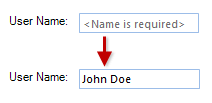
By default, when the control receives focus, this text is automatically removed. This behavior can be controlled by the ShowNullText property. If it is set to true the NullText will be shown even when the text box is focused until you enter some text in the editor.
| ShowNullText=false | ShowNullText=true |
|---|---|
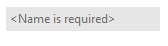 |
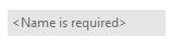 |
Since R1 2017 RadTextBox can show a clear button when there is some text in the editor. This is controlled by the ShowClearButton property.
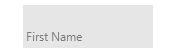
Embedded Labels
Since R2 2021 RadTextBox supports embedded labels. The embedded label shows a text in the text box field usually to indicate what text should the user enter in the text box. When RadTextBox gets focus the embedded label will go up, so the user can type in the text box field. The ShowEmbeddedLabel property controls whether the embedded label is shown. You can set the desired text by using the EmbeddedLabelText property.
Example 1: Setting the embedded label
this.radTextBox1.ShowEmbeddedLabel = true;
this.radTextBox1.EmbeddedLabelText = "First Name";
Me.RadTextBox1.ShowEmbeddedLabel = True
Me.RadTextBox1.EmbeddedLabelText = "First Name"
RadTextBoxElement exposes the following useful properties related to embedded labels. You can access them through the TextBoxElement property:
- EmbeddedLabel - Gets an instance of the corresponding embedded label.
- RepositionEmbeddedLabel - Gets or set a value to indicate whether to reposition the embedded label, when text box is empty.
- EmbeddedLabelAnimationSpeed - Gets or set the animation speed of the embedded label. The speed is an integer between 1 and 10 (slowest) with default value 8.