Themes
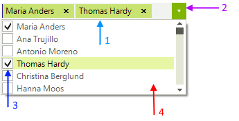
RadCheckedDropDownList, as other RadControls, reuses some components and respectively their theming. It consists of 4 different controls:

RadAutoCompleteBox - Provides theming for the text area and the tokens
RadDropDownList - Provides theming for the arrow button and the size of the control
RadCheckMark - Provides theming for the checkboxes of the items
RadListControl - Provides theming for the items in the dropdown
You can see where to find each control in Visual Style Builder on the image below. We recommend to you to get to know Visual Style Builder before doing any serious theming work.
If you want to use separate themes for RadCheckedDropDownList and RadAutoCompleteBox for example, you need to create two different themes. Use the ThemeResolutionService.ApplyThemeToControlTree method to apply a theme to a single control.
