Design Time
To start using RadCheckedListBox just drag it from the toolbox and drop it at the form.
Smart Tag
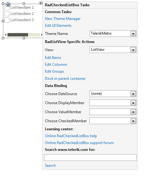
Select RadCheckedListBox and click the small arrow on the top right position in order to open the Smart Tag.
Figure 1: Smart Tag

-
Common Tasks
New Theme Manager: Adds a new RadThemeManager component to the form.
Edit UI elements: Opens a dialog that displays the Element Hierarchy Editor. This editor lets you browse all the elements in the control.
Theme Name: Select a theme name from the drop down list of themes available for that control. Selecting a theme allows you to change all aspects of the controls visual style at one time.
-
RadListView Specific Actions:
View: Specifies the ViewType.
Edit Items: Opens the ListViewDataItem Collection Editor.
Edit Columns: Opens the ListViewDetailColumn Collection Editor.
Edit Groups: Opens the ListViewDataItemGroup Collection Editor.
Dock in parent container: Docks to the parent container to fill the entire space.
-
DataBinding:
Choose DataSource: Specifies the DataSource.
Choose DisplayMember: Specifies the DisplayMember.
Choose ValueMember: Specifies the ValueMember.
Choose CheckedMember: Specifies the CheckedMember.
Learning Center: Navigate to the Telerik help, code library projects or support forum.
Search: Search the Telerik site for a given string.