Explore UI for Silverlight Control Features
Once you have the controls working in your project, it's time to see what they can do. This article provides a short overview of how to get started with finding control functionality so you can use it.
Demos
To get an overview of what each control offers, the fastest approach is to go to our Live Demos.
You can also download the source code of the demo application from your telerik.com account as a Visual Studio project and play around with the demos in the comfort of your IDE. The Telerik_UI_for_WPF_[version]_Demos.zip archive contains the respective source code.
Explore properties and tags
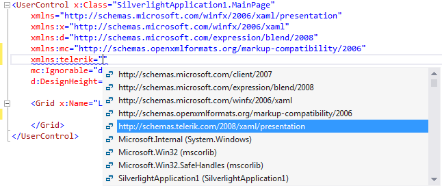
You can explore the available properties, events and inner tags of any control through the VS intellisense to get a quick glimpse of their concepts and availability.
Figure 1: Explore Intellisense in the markup

Figure 2: Explore Inetllisense in the code-behind

Documentation
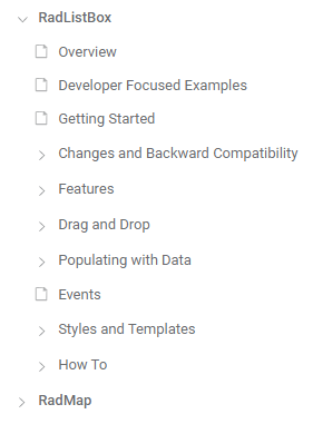
In addition to that, the documentation provides a section for each control that contains help articles on distinct features and API reference.
Figure 3: Typical control documentation structure

Design-time
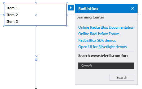
Last, but not least, some most common tasks and configuration options are available in the control's Smart Tag in Design Mode. You will also find design-time wizards and links that can be useful when you are getting started with a feature, or even for advanced users who want to save time with setting up collections, data sources or properties.
Figure 4: Smart Tag features

Next Steps
Now that you have the Telerik UI for Silverlight controls running in your project, you may want to explore their features, customize their behavior or change their appearance. Below you can find guidance on getting started with such tasks: