Template Structure
Like most Silverlight controls, the RadUpload also allows you to template it in order to change the control from the inside. Except for templating the whole control, you can template parts of it or even independent controls related to it. This topic will make you familiar with the:
For more information about templating and how to modify the default templates of the RadControls read the common topics on this matter.
RadUpload Template Structure
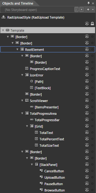
This section will explain the structure of the RadUpload's template. Here is a snapshot of the template generated in Expression Blend.

It contains the following parts:
[Border] - represents the outer border of the RadUpload and is of type Border.
[Border] - represents the inner border of the RadUpload and is of type Border.
RootElement - hosts the template elements and is of type Grid.
[Border] - represents the outer border and the background of the RadUpload's header and is of type Border.
[Border] - represents the inner border of the RadUpload's header and is of type Border.
ProgressCaptionText - represents the text in the RadUpload's header and is of type TextBlock.
IconError - hosts the visual elements, that represent the error icon, and is of type Grid.
[Path] - represents the shape of the error icon and is of type Path.
[TextBlock] - represents the symbols inside the error icon and is of type TextBlock.
[Border] - represents the background of the RadUpload's content area and is of type Border.
[ScrollViewer] - hosts the content of the RadUpload and is of type ScrollViewer.
[ItemsPresenter] - displays the RadUploadItems and is of type ItemsPresenter.
TotalProgressArea - hosts the elements of the total progress area (the overall details) and is of type Grid.
TotalProgressBar - indicates the total progress of the upload and is of type RadProgressBar.
[Grid] - hosts the text elements of the total progress area and is of type Grid.
TotalText - represents the label of the total progress area and is of type TextBlock.
TotalPercentText - displays the progress of the total upload in percentage and is of type TextBlock.
TotalSizeText - displays the total size of the upload and is of type TextBlock.
[Border] - represents the background and the outer border of the command area and is of type Border.
[Border] - represents the inner border of the command area and is of type Border.
[StackPanel] - hosts the buttons in the command area and is of type StackPanel.
CancelButton - represents the Cancel Button and is of type Button.
UploadButton - represents the Upload Button and is of type Button.
PauseButton - represents the Pause/Resume Button and is of type Button.
BrowseButton - represents the Browse/Add more files Button and is of type Button.
RadUploadItem Template Structure
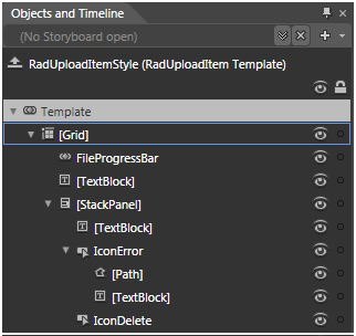
This section will explain the structure of the RadUploadItem's template. Here is a snapshot of the template generated in Expression Blend.

It contains the following parts:
[Grid] - hosts the elements of the template and is of type Grid.
FileProgressBar - represents the progress bar for the RadUploadItem and is of type ProgressBar.
[TextBlock] - displays the name of the file and is of type TextBlock.
[StackPanel] - hosts the details for the file and is of type StackPanel.
[TextBlock] - displays the size of the file and is of type TextBlock.
IconError - hosts the visual elements, that represent the error icon, and is of type Button.
[Path] - represents the shape of the error icon and is of type Path.
[TextBlock] - represents the symbols inside the error icon and is of type TextBlock.
IconDelete - represents the remove file icon and is of type Button.