Visual Structure
This section defines the terms and concepts used in the scope of RadUpload that you have to get familiar with prior to continue reading this help. They can also be helpful when contacting the support service in order to describe your issue better. Below you can see snapshots and explanations of the main states and visual elements of the standard RadUpload control.
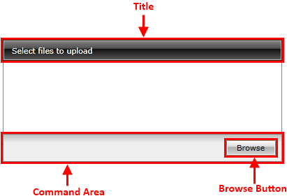
The RadUpload is an user interface control, that provides the users with a way to upload their files to a server. In its default state the following visual elements can be seen.

Title - Shows information related to the control's state, for example: "Select files to upload", "Uploading...", "Upload Done".
Command Area - holds the command buttons that allow the user to interact with the control.
Browse Button - opens the browse dialog window. All previously selected files will be removed from the upload list.
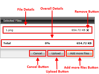
After selecting some files from the browse dialog window, the following elements can be seen.

Add more files Button - it is the same as the Browse Button. The only difference is that the upload list will not be cleared.
File Details - displays details about the particular file, such as file name, file size.
Remove Button - removes the particular file from the upload list.
Overall Details - displays details about the entire upload, such as total file size.
Upload Button - starts the upload of the selected files.
Cancel Button - clears the upload list.
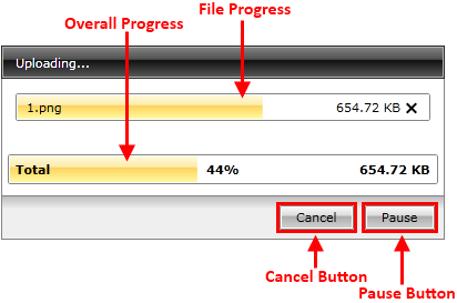
When the upload process has been started the following elements are available.

Pause Button - pauses the upload process.
Resume Button - resumes the paused upload.
File Progress - represents the upload progress for the particular file.
Overall Progress - represents the total upload progress.
Cancel Button - breaks the upload and clears the upload list.