Styling the RibbonScrollViewer
The RibbonScrollViewer control is used both in the template structure of the RadRibbonView to host the RibbonTabs and in the template structure of the RadRibbonTab control to host its content. If you want to edit its default style, you need to first edit the RadRibbonView or RadRibbonTab ControlTemplate. This article will demonstrate how to edit the default style of the RibbonScrollViewer control hosting the RibbonTabs inside the RadRibbonView.
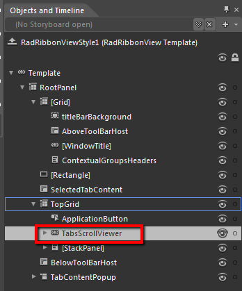
Once you open the ControlTemplate of the RadRibbonView in the 'Objects and Timeline' pane, you need to locate the TabsScrollViewer element.
From the menu choose Object -> Edit Template -> Edit a Copy. You will be prompted for the name of the style and where to be placed.
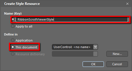
After clicking 'OK', Expression Blend will generate the default style of the RibbonScrollViewer control in the Resources section of your User Control. The properties available for the style will be loaded in the 'Properties' pane and you will be able to modify their default values.
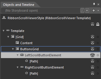
You can further customize the appearance of the RibbonScrollViewer by editing the default style of the Left/RightScrollButtonElements and their [Path] elements.
If you go to the 'Resources' pane, you will see an editable list of resources generated together with the style and used by it. In this list you will find the brushes, styles and templates needed to change the visual appearance of the RibbonScrollViewer. Their names indicate to which part of the RibbonScrollViewer's appearance they are assigned.
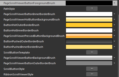
PageScrollViewerButtonInnerBorderBrush - a brush, that represents the inner border brush of the RibbonScrollViewer Left/RightScrollButtonElements
PageScrollViewerPressedButtonBackgroundBrush - a brush, that represents the background color of the RibbonScrollViewer Left/RightScrollButtonElements, when they are pressed
ButtonPushedOuterBorderBrush - a brush that represents the border brush of the RibbonScrollViewer Left/RightScrollButtonElements, when they are pressed
ButtonPushedInnerBorderBrush - a brush that represents the inner border brush of the RibbonScrollViewer Left/RightScrollButtonElements, when they are pressed
ButtonHotInnerBorderBrush - a brush that represents the inner border brush of the RibbonScrollViewer Left/RightScrollButtonElements, when the mouse is over them
ButtonHotOuterBorderBrush - a brush that represents the border brush of the RibbonScrollViewer Left/RightScrollButtonElements, when the mouse is over them
PageScrollViewerHotButtonBackgroundBrush - a brush that represents the background color of the RibbonScrollViewer Left/RightScrollButtonElements, when the mouse is over them
PageScrollViewerButtonForegroundBrush - a brush that represents the fill of the path displayed in the RibbonScrollViewer Left/RightScrollButtonElements