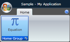
Styling the Ribbon GroupChrome
In order to style the GroupChrome control, which represents the uncollapsed group, you have to generate the default style for the RadRibbonGroup
. To see how to do it take a look at the Styling the Ribbon Group topic.
From the resources generated for the RadRibbonGroup's style modify the RadRibbonGroupStyle, by clicking on its icon.
It will be loaded in the 'Objects and Timeline' pane. Right-click on it and choose Edit Template -> Edit Current. In the 'Objects and Timeline' the parts of the RadRibbonGroup's template will get loaded. Select the part called ExpandedChrome.
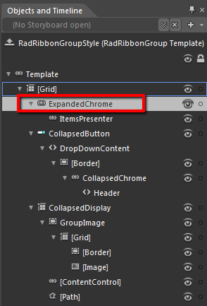
From the menu select Object -> Edit Style -> Edit a Copy. You will be prompted for the name of the style and where to be placed.
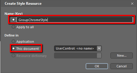
If you choose to define the style in Application, it would be available for the entire application. This allows you to define a style only once and then reuse it where needed.
After clicking 'OK', Expression Blend will generate the default style of the GroupChrome control in the Resources section of your User Control. The properties available for the style will be loaded in the 'Properties' pane and you will be able to modify their default values.If you want to change the ControlTemplate elements of the RadRibbonGroup select the style in the 'Objects and Timeline' pane, right-click on it and choose Edit Template -> Edit Current. In the same pane the element parts for the RadRibbonGroup's template will get loaded.
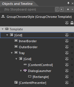
If you go to the 'Resources' pane, you will see an editable list of resources generated together with the style and used by it. In this list you will find the brushes, styles and templates needed to change the visual appearance of the GroupChrome. Their names indicate to which part of the GroupChrome's appearance they are assigned.
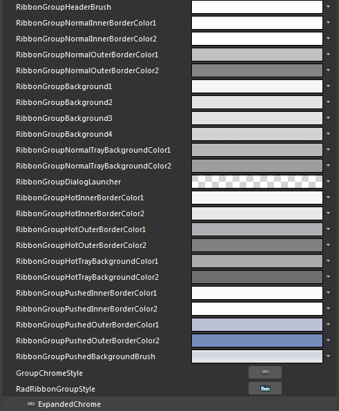
RibbonGroupHeaderBrush - a brush that represents the Foreground color of the GroupChrome footer content
RibbonGroupNormalInnerBorderColor1, RibbonGroupNormalInnerBorderColor2 - brushes that represent the color of the inner border of the GroupChrome.
RibbonGroupNormalOuterBorderColor1, RibbonGroupNormalOuterBorderColor2 - brushes that represent the color of the outer border of the GroupChrome.
RibbonGroupBackground1, RibbonGroupBackground2, RibbonGroupBackground3, RibbonGroupBackground4 - brushes that represent the background color of the GroupChrome
RibbonGroupNormalTrayBackgroundColor1, RibbonGroupNormalTrayBackgroundColor2 - brushes that represent the background color of the footer of the GroupChrome.
RibbonGroupDialogLauncher - an image brush that represents the image for the DialogLauncher button.
RibbonGroupHotInnerBorderColor1, RibbonGroupHotInnerBorderColor2 - brushes that represent the color of the inner border of the GroupChrome, when the mouse is over it.
RibbonGroupHotOuterBorderColor1, RibbonGroupHotOuterBorderColor2 - brushes that represent the color of the outer border of the GroupChrome, when the mouse is over it.
RibbonGroupHotTrayBackgroundColor1, RibbonGroupHotTrayBackgroundColor2 - brushes that represent the background color of the footer of the GroupChrome, when the mouse is over it.
RibbonGroupPushedInnerBorderColor1, RibbonGroupPushedInnerBorderColor2- brushes that represent the color of the inner border of the __GroupChrome,__when when it is collapsed and pressed.
RibbonGroupPushedOuterBorderColor1, RibbonGroupPushedOuterBorderColor2- brushes that represent the color of the outer border of the GroupChrome, when it is collapsed and pressed.
RibbonGroupPushedBackgroundBrush - brushes that represent the color of the outer border of the GroupChrome, when it is collapsed and pressed.
GroupChromeStyle - represents the style applied to the GroupChrome control.
Changing the value of the resources can be done by clicking on the color indicator or the icon next to them.
Modify the resource to bring the desired appearance to the RadRibbonGroup. For more detailed information, please, view the Example section below.
Example
Here is an example of the above resource modified.
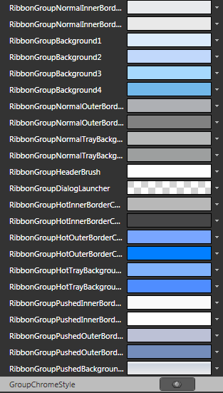
Here is a snapshot of the result when the mouse is over the group
