Getting Started with Silverlight PdfViewer
RadPdfViewer is a control that allows you to display PDF files natively in Silverlight. This topic helps you to quickly get started using the control. It focuses on the following:
- Adding the Required Assembly References
- Declaring RadPdfViewer in XAML
- Wiring UI with the Commands of RadPdfViewer
Assembly References
The minimal set of assembly references you need to add to your Silverlight project in order to use RadPdfViewer are listed below:
- Telerik.Windows.Controls.dll
- Telerik.Windows.Controls.FixedDocumentViewers.dll
- Telerik.Windows.Documents.Core.dll
- Telerik.Windows.Documents.Fixed.dll
- Telerik.Windows.Zip.dll
If you want to include a RadToolBar, you also need to reference:
- Telerik.Windows.Controls.Input.dll
- Telerik.Windows.Controls.Navigation.dll
You can also take advantage of some RadPdfViewer-specific controls such as FindDialog and PercentComboBox. To use them, you need to add the following references to your project:
- Telerik.Windows.Controls.Input.dll
-
Telerik.Windows.Controls.Navigation.dll
- Telerik.Windows.Controls.FixedDocumentViewersUI.dll
RadPdfViewer can also import and show documents containing predefined CMap tables. To enable this functionality with the default implementation, you will need to add a reference to:
- Telerik.Windows.Documents.CMapUtils.dll
Check the CMap tables topic for more details on importing documents containing that feature.
Adding RadPdfViewer to a Page
You have to first declare the Telerik namespace.
Example 1: Declare the Telerik namespace
After that, you can add a RadPdfViewer, as shown in Example 2.
Example 2: Create a PdfViewer
<Grid>
    <telerik:RadPdfViewer x:Name="pdfViewer"/>
</Grid>
When you create a RadPdfViewer, ensure that the control is not placed in a container that measures its children in Infinity as this could lead to unexpected behavior of the viewer. Examples of such containers are ScrollViewer, StackPanel or Grid with row height and column width set to Auto.
Wiring the UI with RadPdfViewer Commands
The navigation panel is separated from the control to provide better customization options. In order to add a panel in your application, you can use RadToolBar, which has the command descriptors of the viewer as a DataContext.
Example 3: Add a RadToolBar to RadPdfViewer
<telerik:RadToolBar DataContext="{Binding ElementName=pdfViewer, Path=CommandDescriptors}">
    <!--...-->
</telerik:RadToolBar>
You can download a complete runnable example that shows the default RadPdfViewer with RadToolBar configuration from the Telerik® SDK repository.
You can then add buttons, combo boxes, etc., bound to the respective command descriptors of the viewer, as Example 4 shows.
Example 4: Wire a CommandDescriptor to a RadButton
<telerik:RadButton Command="{Binding OpenCommandDescriptor.Command}" Visibility="{Binding OpenCommandDescriptor.IsEnabled, Converter={StaticResource BoolToVisibilityConverter}}" HorizontalAlignment="Left" VerticalAlignment="Stretch" Margin="2" Padding="0" HorizontalContentAlignment="Center" VerticalContentAlignment="Center" IsBackgroundVisible="False">
    <ToolTipService.ToolTip>
        <TextBlock Text="Open" />
    </ToolTipService.ToolTip>
    <Image Source="{telerik:IconResource IconRelativePath=open.png, IconSources={StaticResource IconPaths}}" Stretch="None" />
</telerik:RadButton>
For the whole configuration of a RadToolBar with all commands of the viewer, you can refer to the Wiring UI article. More information about the command descriptors is available here.
After you configure RadPdfViewer in this way, the control is ready to use. Additional options, such as showing a PDF document when the viewer is loaded or binding the document, are described in the Showing a File article.
Setting a Theme
The controls from our suite support different themes. You can see how to apply a theme different than the default one in the Setting a Theme help article.
Changing the theme using implicit styles will affect all controls that have styles defined in the merged resource dictionaries. This is applicable only for the controls in the scope in which the resources are merged.
To change the theme, you can follow the steps below:
Choose between the themes and add reference to the corresponding theme assembly (ex: Telerik.Windows.Themes.Windows8.dll). You can see the different themes applied in the Theming examples from our Silverlight Controls Examples application.
-
Merge the ResourceDictionaries with the namespace required for the controls that you are using from the theme assembly. For RadPdfViewer, you will need to merge the following resources:
- Telerik.Windows.Controls
If you are using other controls like RadToolBar or RadPdfViewer-specific controls, you need also to merge the DLLs mentioned at the top of this article.
Example 5 demonstrates how to merge the ResourceDictionaries so that they are applied globally for the entire application.
Example 5: Merge the ResourceDictionaries
    <Application.Resources>
        <ResourceDictionary>
            <ResourceDictionary.MergedDictionaries>
                <ResourceDictionary Source="/Telerik.Windows.Themes.Windows8;component/Themes/System.Windows.xaml"/>
                <ResourceDictionary Source="/Telerik.Windows.Themes.Windows8;component/Themes/Telerik.Windows.Controls.xaml"/>
            </ResourceDictionary.MergedDictionaries>
        </ResourceDictionary>
    </Application.Resources>
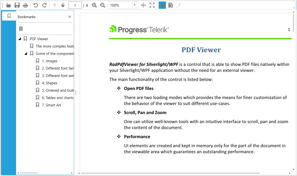
Figure 1: RadPdfViewer with the Windows8 theme
