Template Structure
Like most Silverlight controls, the RadMaskedInput controls also allow you to template them in order to change the control from the inside. Except for templating a whole control, you can template only parts of it or even independent controls related to it. The style of each RadMaskedInput controls is based on a RadMaskedInputBaseStyle. This topic will make you familiar with the structure of the RadMaskedInputBase templates.
RadMaskedInputBase Template
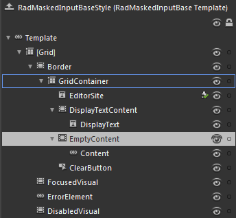
Here is a snapshot of the template generated in Expression Blend.

-
[Grid] - hosts the elements of the RadMaskedInputBase template and is of type Grid
-
[Border] - represents the outer border of the RadMaskedInput controls and is of type Border
-
GridContainer - hosts the functional parts of the RadMaskedInput controls
EditorSite - represents a text box that implements the masking behavior while editing the RadMaskedInput control Value and is of type PreviewInputTextBox
-
DisplayTextContent - hosts the content of the RadMaskedInput control when the control isn't focused and is of type Border
- DisplayText - represents a text box that is visible when the RadMaskedInput control isn't focused and is of type PreviewInputTextBox
-
EmptyContent - hosts the elements that get displayed when the content of the DisplayText is empty and is of type Border
- Content - represents the content of the RadMaskedInput when the DisplayText is empty, and is of type ContentControl
ClearButton- represent the Clear Button and is of type RadButton
FocusedVisual - represents the visual element, that appears when the RadMaskedInput control gets focused, and is of type Border
ErrorElement- represent the tooltip that appears when the content of the DisplayText is invalid and is of type ValidationTooltip
DisabledVisual - represents the visual element, that appears when the RadMaskedInput control is disabled, and is of type Border
-
-