Common
This article lists features that are common between the RadMaskedInput controls.
- No-Mask Functionality
- Input Behavior
- Text and TextMode
- ValueToTextConverter
- Add/Remove the ClearButton
- IsLastPositionEditable
- TextBoxStyle
No-Mask Functionality
You can take advantage of the 'no-mask' functionality of the RadMaskedTextInput,RadMaskedNumericInput and the RadMaskedCurrenyInput controls by setting the Mask property to "" like so:
Example 1: Setting no-mask functionality
<telerik:RadMaskedTextInput  Mask=""/>
<telerik:RadMaskedCurrencyInput  Mask=""/>
<telerik:RadMaskedDateTimeInput  Mask=""/>
<telerik:RadMaskedNumericInput Mask=""/>
This feature creates RadMaskedInput controls that allow unlimited input. And as the Mask property is empty, the controls won't expect a certain number of characters and this is why they will automatically update to fit the user input.
The 'no-mask' functionality will remove the restrictions usually applied by the Mask property on the type and the number of input characters in each of the controls. Still you can set the FormatString property to control the input in the RadMaskedInput controls when they don't specify a Mask. For example you can use the Standard Numeric Format Strings and Custom Numeric Format Strings to control the input in the RadMaskedNumericInput and the RadMaskedCurrencyInput. This means that if you need to restrict the number of digits after the decimal point to 2 in a RadMaskedNumericInput, you can set its FormatString property to "n2":
<telerik:RadMaskedNumericInput Mask="" FormatString="n2"/>
Input Behavior
The RadMaskedInput controls allow you to specify the characters input behavior using the InputBehavior property. The property is an enumeration of type InputBehavior and exposes the following values:
Replace: Inputs characters on the right of the current caret position.
Insert: Inserts characters before the caret's current position for as long as there are empty positions to fill. When there are no empty positions to fill on left of the caret, then the characters are added on right of the caret.
You can change the InputBehavior using the Insert key. Also please keep in mind that the InputBehavior reflects the behavior of the Backspace and Delete keys
Text and TextMode properties
The RadMaskedInput controls expose a Text property that gets the value displayed in the control when it isn't focused. The value of this property depends on the TextMode enumeration, that exposed the following values:
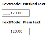
MaskedText: When this mode is enabled the Text property value represents the formatted Value including the placeholder characters.
PlainText: When this mode is enabled the Text property value represents the formatted Value without the placeholder characters.
Example 2: Setting TextMode property in XAML
<StackPanel HorizontalAlignment="Center" VerticalAlignment="Center">
    <TextBlock Margin="10, 10, 10, 0"
               FontWeight="Bold"
               Text="TextMode: MaskedText" />
    <telerik:RadMaskedNumericInput Margin="10, 10, 10, 0"
                                   Mask="#6.2"
                                   TextMode="MaskedText"
                                   Value="123" />
    <TextBlock Margin="10, 10, 10, 0"
               FontWeight="Bold"
               Text="TextMode: PlainText" />
    <telerik:RadMaskedNumericInput Margin="10, 10, 10, 0"
                                   Mask="#6.2"
                                   TextMode="PlainText"
                                   Value="123" />
</StackPanel>

ValueToTextConverter
The RadMaskedInput controls allow you to set an IValueConverter to change the Text property depending on the Value. The following example will illustrate a sample implementation of the ValueToTextConverter property.
Let's start by defining an IValueConverter:
Example 3: Implementing IValueConverter interface
public class NumericValueToTextConverter : IValueConverter
{
    public object Convert(object value, Type targetType, object parameter, System.Globalization.CultureInfo culture)
    {
        if (value != null)
        {
            double doubleValue = 0d;
            decimal decimalValue = 0m;
            if (double.TryParse(value.ToString(), System.Globalization.NumberStyles.Number, culture, out doubleValue))
            {
                return "Double Value: " + doubleValue.ToString("n4");
            }
            else if (decimal.TryParse(value.ToString(), System.Globalization.NumberStyles.Any, culture, out decimalValue))
            {
                return "Decimal Value: " + decimalValue.ToString("c4");
            }
            else return value.ToString();
        }
        else
        {
            return value;
        }
    }
    public object ConvertBack(object value, Type targetType, object parameter, System.Globalization.CultureInfo culture)
    {
        throw new NotImplementedException();
    }
}
Public Class NumericValueToTextConverter
    Implements IValueConverter
    Public Function Convert(value As Object, targetType As Type, parameter As Object, culture As System.Globalization.CultureInfo) As Object Implements IValueConverter.Convert
        If value IsNot Nothing Then
            Dim doubleValue As Double = 0.0
            Dim decimalValue As Decimal = 0D
            If Double.TryParse(value.ToString(), System.Globalization.NumberStyles.Number, culture, doubleValue) Then
                Return "Double Value: " & doubleValue.ToString("n4")
            ElseIf Decimal.TryParse(value.ToString(), System.Globalization.NumberStyles.Any, culture, decimalValue) Then
                Return "Decimal Value: " & decimalValue.ToString("c4")
            Else
                Return value.ToString()
            End If
        Else
            Return value
        End If
    End Function
    Public Function ConvertBack(value As Object, targetType As Type, parameter As Object, culture As System.Globalization.CultureInfo) As Object Implements IValueConverter.ConvertBack
        Return value
        'Throw New NotImplementedException()
    End Function
End Class
Now we can define the NumericValueToTextConverter as a resource in our application and apply it to the RadMaskedNumericInput properties.
Example 5: Setting the IValueConverter to the ValueToTextConverter property in XAML
<StackPanel HorizontalAlignment="Center" VerticalAlignment="Center">
    <StackPanel.Resources>
      <local:NumericValueToTextConverter x:Key="numericValueToTextConverter" />
    </StackPanel.Resources>
    <telerik:RadMaskedNumericInput Grid.Row="0"
                                   Width="220"
                                   Margin="10, 10, 10, 0"
                                   IsClearButtonVisible="False"
                                   TextMode="PlainText"
                                   ValueToTextConverter="{StaticResource numericValueToTextConverter}"
                                   Value="123.45" />
</StackPanel>

Add/Remove the ClearButton
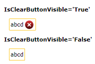
The default Template of the RadMaskedInput controls defines a ClearButton that allows the user to clear the input. You can hide this button by setting the IsClearButtonVisible property to False.
Example 6: Setting the IsClearButtonVisible property
<StackPanel HorizontalAlignment="Center" VerticalAlignment="Center">
    <TextBlock FontWeight="Bold" Text="IsClearButtonVisible='True'" />
    <telerik:RadMaskedTextInput Margin="10"
                                Mask="llll"
                                Value="abcd" />
    <TextBlock FontWeight="Bold" Text="IsClearButtonVisible='False'" />
    <telerik:RadMaskedTextInput Margin="10"
                                IsClearButtonVisible="False"
                                Mask="llll"
                                Value="abcd" />
</StackPanel>

IsLastPositionEditable
The IsLastPositionEditable property indicates whether the last position in the RadMaskedInput controls can be modified or not. If the property is set to True, the user will be able to edit the value in the last available position of the control. This is the default behavior of the RadMaskedInput controls. However, if you need to restrict the user from changing this value, you can set the IsLastPositionEditable property to False.
TextBoxStyle
The RadMaskedInput controls have a TextBoxStyle property which allows you to modify the style of the underlying text box element representing the input. The property is of type Style which targets TextBox.
Example 7: Setting TextBoxStyle
<telerik:RadMaskedTextInput>
    <telerik:RadMaskedTextInput.TextBoxStyle>
        <Style TargetType="TextBox">
            <Setter Property="TextWrapping" Value="Wrap" />
            <Setter Property="SelectionBrush" Value="Green" />
        </Style>
    </telerik:RadMaskedTextInput.TextBoxStyle>
</telerik:RadMaskedTextInput>