FunnelSeries
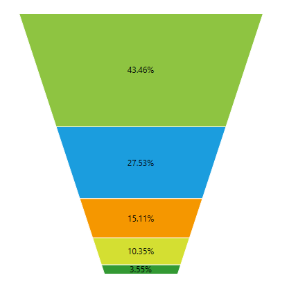
The FunnelSeries displays a single series of data in progressively decreasing or increasing proportions, organized in segments, where each segment represents the value for the particular item from the series. The size of each segment is determined by the value of the corresponding series item.
Declaratively defined series
You can use the following definition to display a simple FunnelSeries:
Example 1: Declaring an FunnelSeries in XAML
<telerik:RadFunnelChart Palette="Windows8">
    <telerik:FunnelSeries>
        <telerik:FunnelSeries.DataPoints>
            <telerik:FunnelDataPoint Value="100" Label="100 %"/>
            <telerik:FunnelDataPoint Value="80" Label="80 %"/>
            <telerik:FunnelDataPoint Value="58" Label="58 %"/>
            <telerik:FunnelDataPoint Value="40" Label="40 %"/>
            <telerik:FunnelDataPoint Value="25" Label="25 %"/>
        </telerik:FunnelSeries.DataPoints>
    </telerik:FunnelSeries>
</telerik:RadFunnelChart>
Figure 1: FunnelSeries visual appearance

Properties
- ValueBinding: A property of type DataPointBinding that gets or sets the property path that determines the value of the data point.
- DataPoints: A property of type ElementCollection of FunnelDataPoints that gets the collection associated with the series.
- IsDynamicHeight: A boolean property that gets or sets if all segments in the series have the same height or the height of every segment is set according to its value. Default value is true.
- IsDynamicSlope: A boolean property that gets or sets a value indicating whether the form of each segment will be based on the ratio between the value from the current and the next segment. Default value is false.
- LabelFormat: A property of type string that gets or sets the string used to format the default label of the Segments which is the Label of the FunnelDataPoint.
- NeckRatio: A property of type float that gets or sets a value indicating the ratio between the top and the bottom bases of the whole funnel series.
This property can take effect only if the Telerik.Windows.Controls.ChartView.FunnelSeries.IsDynamicSlope property is set to false.
- SegmentSpacing: A property of type int that gets or sets a value indicating the space between the funnel segments in pixels.
- SegmentStyles: A ObservableCollection of Styles that gets the styles applied to every segment in the series.
Data Binding
You can use the ValueBinding property of the FunnelSeries to bind the DataPoint property to the property from your view models.
Example 2: Defining the view model
public class PlotInfo
{
    public double Value { get; set; }
}

//.......
this.DataContext = new ObservableCollection<PlotInfo>
{
    new PlotInfo() { Value = 100},
    //....
};
Example 3: Specify a FunnelSeries in XAML
<telerik:FunnelSeries ItemsSource="{Binding}" ValueBinding="Value" />
See the Create Data-Bound Chart for more information on data binding in the RadChartView suite.
Label Connectors
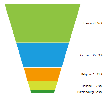
FunnelSeries supports drawing of connector lines between the series' data points and their labels. In order to enable this feature you can set the chart series' LabelConnectorsSettings property. The property accepts an object of type ChartSeriesLabelConnectorsSettings which exposes the following properties:
- FadeOpacity: A property of type double that gets or sets the opacity that is applied to the label connectors when the series is faded by the chart's hover interactivity.
- MinLengthThreshold: A property of type double that gets or sets the min length threshold. If a label connector is shorter than this threshold, the label connector is not drawn.
- Style: A Style property that gets or sets the connectors' style. The property accepts a Style targeting a Path element.
The following example demonstrates how to set the LabelConnectorsSettings propety:
Example 4: Set label connectors
<telerik:RadFunnelChart  Margin="50 50 100 50"  Palette="Windows8" ClipToBounds="False">
    <telerik:FunnelSeries ShowLabels="True" Width="50" ClipToPlotArea="False">
        <telerik:FunnelSeries.DataPoints>
            <telerik:FunnelDataPoint Value="43.46" Label="France: 43.46%"/>
            <telerik:FunnelDataPoint Value="27.53" Label="Germany: 27.53%" />
            <telerik:FunnelDataPoint Value="15.11" Label="Belgium: 15.11%" />
            <telerik:FunnelDataPoint Value="10.35" Label="Holland: 10.35%" />
            <telerik:FunnelDataPoint Value="3.55" Label="Luxembourg: 3.55%" />
        </telerik:FunnelSeries.DataPoints>
        <telerik:FunnelSeries.LabelDefinitions>
            <telerik:ChartSeriesLabelDefinition HorizontalAlignment="Right" VerticalAlignment="Center" Margin="100 0 10 0"/>
        </telerik:FunnelSeries.LabelDefinitions>
        <telerik:FunnelSeries.LabelConnectorsSettings>
            <telerik:ChartSeriesLabelConnectorsSettings/>
        </telerik:FunnelSeries.LabelConnectorsSettings>
    </telerik:FunnelSeries>
</telerik:RadFunnelChart>
Figure 1: Label connectors visual appearance

Styling the Series
You can see how to style funnel series using different properties in the Customizing FunnelChart Series help article.
Additionally, you can use the Palette property of the chart to change the colors of the FunnelSeries on a global scale. You can find more information about this feature in the Palettes section in our help documentation.