Styling the Chart Series
There are four ways to style the chart series. The first and easier one is to use the shortcut visual properties of the ISeriesDefinition interface
the second is to use the complex styles property provided by the ChartArea of the RadChart , the third is to use Palette Brushes and the forth is to retemplate the default series style.
Styling the Series via the SeriesDefinition classes
This is the easiest approach that you can use in order to style the chart series. It uses the shortcut visual properties exposed by the ISeriesDefinition interface. These properties can be found under the Appearance complex property for each one of the series. Here is a list of them:
Fill - gets or sets the brush that describes the fill for the corresponding chart series type.
Stroke - gets or sets the brush that describes the stroke for the corresponding chart series type.
StrokeThickness - stroke thickness for the corresponding chart series type.
For series that have no concept of Fill such as Line, Spline, Stick, etc. the Stroke/StrokeThickness value is the brush that defines the appearance of the whole visual segment.
- Cursor - gets or sets the mouse cursor that appears when the mouse pointer hovers over a chart series item element.
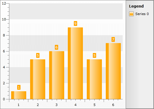
For example, you can change the appearance of a BarSeries in the following way.
BarSeriesDefinition barDefinition = new BarSeriesDefinition();
barDefinition.Appearance.Fill = new SolidColorBrush( Colors.Orange );
this.radChart.DefaultSeriesDefinition = barDefinition;
Dim barDefinition As New BarSeriesDefinition()
barDefinition.Appearance.Fill = New SolidColorBrush(Colors.Orange)
Me.radChart.DefaultSeriesDefinition = barDefinition
Here is the result.
Styling the Series via Styles
The second way is to define a style and set it through the SeriesStyles complex property of the ChartArea. It contains style entries for all distinct series types. These types can be divided in two groups - Self-Drawing (Continuous) Series and Item-Drawn (Discrete) Series.
Using this type of styling only the series elements will get customized, the item labels and the legend items will remain with their default appearance.
By setting the Styles this way, they will get applied to every series of this type. In order to use styles and apply them to certain series you can combine the two methods. This is done by setting them to the SeriesDefinition.ItemStyle property for item-drawn series or the SeriesDefinition.SeriesStyle property for self-drawn series.
- To create a style for the Self-Drawing Series (Line, StackedLine, Spline, StackedSpline, Area, StackedArea, StackedArea100, SplineArea, StackedSplineArea, StackedSplineArea100, Range, SplineRange) you have to create a style that targets the SelfDrawingSeries class in the Telerik.Windows.Controls.Charting namespace.
<Style x:Key="SelfDrawingSeriesStyle" TargetType="telerik:SelfDrawingSeries" />
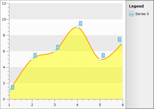
The type exposes two style properties - BorderLineStyle and BackgroundStyle. The BorderLineStyle is obligatory, as it defines the main chart contour. The BackgroundStyle must be set when your chart represents an area. Here is an example:
<Style x:Key="SplineAreaStyle" TargetType="telerik:SelfDrawingSeries">
    <Setter Property="BorderLineStyle">
        <Setter.Value>
            <Style TargetType="Shape">
                <Setter Property="Stroke" Value="Orange" />
                <Setter Property="StrokeThickness" Value="3" />
            </Style>
        </Setter.Value>
    </Setter>
    <Setter Property="BackgroundStyle">
        <Setter.Value>
            <Style TargetType="Shape">
                <Setter Property="Fill" Value="Yellow" />
                <Setter Property="Opacity" Value="0.5" />
            </Style>
        </Setter.Value>
    </Setter>
</Style>
this.radChart.DefaultView.ChartArea.SeriesStyles.SplineAreaSeriesStyle = this.Resources[ "SplineAreaStyle" ] as Style;
Me.radChart.DefaultView.ChartArea.SeriesStyles.SplineAreaSeriesStyle = TryCast(Me.Resources("SplineAreaStyle"), Style)
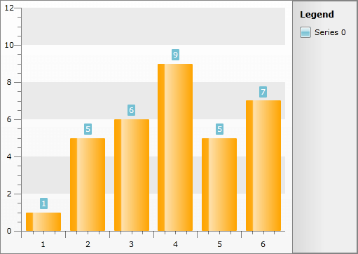
- To create a style for the Item-Drawn Series (Bar, StackedBar, StackedBar100, HorizontalBar, HorizontalStackedBar, HorizontalStackedBar100, Pie, Doughnut, Stick, CandleStick, Bubble) you have to create a style that targets the Shape class.
Here is an example:
<Style x:Key="BarStyle" TargetType="Shape">
    <Setter Property="Fill" Value="Orange" />
</Style>
this.radChart.DefaultView.ChartArea.SeriesStyles.BarSeriesStyle = this.Resources[ "BarStyle" ] as Style;
Me.radChart.DefaultView.ChartArea.SeriesStyles.BarSeriesStyle = TryCast(Me.Resources("BarStyle"), Style)
To learn how to change the foreground of the item's label when using styles take a look at the Styling the Item Labels topic.
Styling Series via PaletteBrushes
The RadChart exposes two BrushCollections:
RadChart.PaletteBrushes - defines the brushes used for the series RadChart -wide.
RadChart.DefaultView.ChartArea.PaletteBrushes - defines the brushes used for the series for the specific ChartArea.
The PaletteBrushes property is independent of the series type.
The PaletteBrush collection on the ChartArea level takes precedence over the one on the RadChart level and the latter takes precedence over the theme resources.
The PaletteBrushes is read-only and allows you to specify a set of brushes that will be applied to the series displayed in the RadChart. The pattern of applying is as follows: first series - first brush, second series - second brush.
<telerik:RadChart x:Name="radChart" VerticalAlignment="Top">
    <telerik:RadChart.PaletteBrushes>
        <SolidColorBrush Color="Green" />
        <SolidColorBrush Color="Orange" />
    </telerik:RadChart.PaletteBrushes>
</telerik:RadChart>
or
<telerik:RadChart x:Name="radChart" VerticalAlignment="Top">
    <telerik:RadChart.DefaultView>
        <telerik:ChartDefaultView>
            <telerik:ChartDefaultView.ChartArea>
                <telerik:ChartArea PaletteBrushesRepeat="False">
                    <telerik:ChartArea.PaletteBrushes>
                        <SolidColorBrush Color="Green" />
                        <SolidColorBrush Color="Orange" />
                    </telerik:ChartArea.PaletteBrushes>
                </telerik:ChartArea>
            </telerik:ChartDefaultView.ChartArea>
        </telerik:ChartDefaultView>
    </telerik:RadChart.DefaultView>
</telerik:RadChart>
There are PaletteBrushesRepeat properties in both RadChart and ChartArea, which define the behavior of the palette. When N brushes are added, then the first N series will use those brushes. If PaletteBrushesRepeat is set to True, then the next N series will again use the same colors. When set to False, the next series will fallback to use the other available resources.
For example if you use the ChartArea PaletteBrush collection with PaletteBrushesRepeat set to False, when all of the brushes get used, the next series will fallback to the RadChart PaletteBrushes and after them to the theme resources.
<telerik:RadChart x:Name="radChart"
                  VerticalAlignment="Top"
                  PaletteBrushesRepeat="True">
    <telerik:RadChart.PaletteBrushes>
        <SolidColorBrush Color="Green" />
        <SolidColorBrush Color="Orange" />
    </telerik:RadChart.PaletteBrushes>
</telerik:RadChart>
or
<telerik:RadChart x:Name="radChart"
                  VerticalAlignment="Top"
                  PaletteBrushesRepeat="True">
    <telerik:RadChart.DefaultView>
        <telerik:ChartDefaultView>
            <telerik:ChartDefaultView.ChartArea>
                <telerik:ChartArea PaletteBrushesRepeat="False">
                    <telerik:ChartArea.PaletteBrushes>
                        <SolidColorBrush Color="Green" />
                        <SolidColorBrush Color="Orange" />
                    </telerik:ChartArea.PaletteBrushes>
                </telerik:ChartArea>
            </telerik:ChartDefaultView.ChartArea>
        </telerik:ChartDefaultView>
    </telerik:RadChart.DefaultView>
</telerik:RadChart>
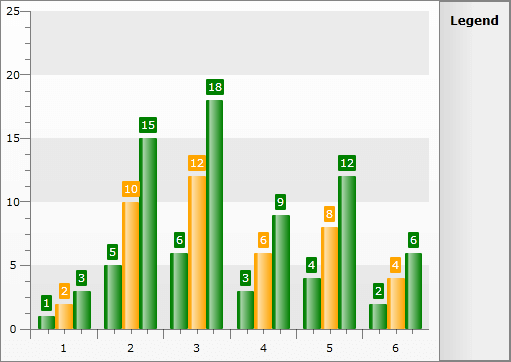
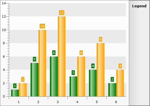
You can set the PaletteBrushesUseSolidColors property to true so that those Themes that have Gradient colors will have their Gradients set to the SolidColors as given in the Palette. Such themes are Vista, Summer and Windows7. For comparison you may take a look at the following two pictures:
- PaletteBrushesUseSolidColors = False and Theme is set to Vista:

- PaletteBrushesUseSolidColors = True and Theme is set to Vista:
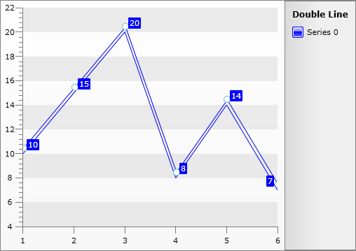
 Styling Series via Retemplating
If you want to see a double line when you create new LineSeriesDefinition the onliest way to do this is by retemplating the default Line Style. The double line appearance can be achieved by Transforming the Line by Y with Value -8 for example. The default Line Fill, Stroke and StrokeThickness values of the LineSeries should be set so that they are same as the properties defined in the Style. Additionally you can style the point marks so that their color equals the one set in the Style as shown in our help topic Styling the Point Marks.
Here is an example:
<Style x:Key="MyDoubleLineStyle" TargetType="telerik:Line">
    <Setter Property="Template">
        <Setter.Value>
            <ControlTemplate TargetType="telerik:Line">
                <Canvas x:Name="PART_MainContainer">
                    <Canvas.RenderTransform>
                        <TranslateTransform X="1" Y="-8" />
                    </Canvas.RenderTransform>
                    <Line x:Name="PART_LineGeometry"
                          Fill="Blue"
                          Stroke="Blue"
                          StrokeThickness="1"
                          Style="{TemplateBinding ItemStyle}"
                          X1="0"
                          X2="{TemplateBinding EndPointX}"
                          Y1="{TemplateBinding StartPointY}"
                          Y2="{TemplateBinding EndPointY}" />
                    <telerik:PointMark x:Name="PART_PointMark"
                                       Canvas.Top="{TemplateBinding StartPointY}"
                                       PointMarkCanvasLeft="{TemplateBinding PointMarkCanvasLeft}"
                                       PointMarkCanvasTop="{TemplateBinding PointMarkCanvasTop}"
                                       ShapeStyle="{TemplateBinding PointMarkShapeStyle}"
                                       Style="{TemplateBinding PointMarkItemStyle}"
                                       Visibility="{TemplateBinding PointMarkVisibility}" />
                </Canvas>
            </ControlTemplate>
        </Setter.Value>
    </Setter>
</Style>
The Default Style is different for RadChart with version older than Q1 2010.
RadChart1.DefaultSeriesDefinition = line;
line.Appearance.Stroke = new SolidColorBrush(System.Windows.Media.Colors.Blue);
line.Appearance.Fill = new SolidColorBrush(System.Windows.Media.Colors.Blue);
line.Appearance.StrokeThickness = 1;
line.ItemStyle = this.Resources["MyDoubleLineStyle"] as Style;
RadChart1.DefaultSeriesDefinition = line
line.Appearance.Stroke = New SolidColorBrush(System.Windows.Media.Colors.Blue)
line.Appearance.Fill = New SolidColorBrush(System.Windows.Media.Colors.Blue)
line.Appearance.StrokeThickness = 1
line.ItemStyle = TryCast(Me.Resources("MyDoubleLineStyle"), Style)