Understanding the Skin CSS File
Styles for RadControls are defined using Cascading Style Sheet (CSS) syntax. Each style consists of a selector that identifies an HTML element to be styled, and property/value pairs that describe each of the style specifics, e.g. color, padding, margins, etc. For example, the ".rtHover" style will underline the text.
.RadTreeView_Telerik .rtHover .rtIn
{
    color:#363636;
    text-decoration:underline;
}
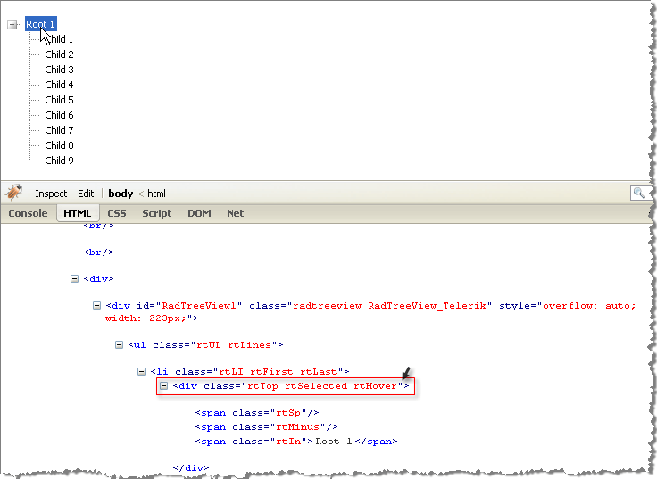
See the CSS Skin File Selectors topic for more information on the specific CSS selectors used for RadTreeView skins. You can see custom styles applied in the screenshot below.
The styled RadTreeView below is running in FireFox browser where Firebug plug-in is used to help visualize the HTML on-the-fly. You can install and use Firebug plug-in to audition changes to the CSS file and see the results instantly.
Each style maps to a "class" attribute in an HTML tag. For example, the ".RadTreeView_Telerik" is a general style that applies to the entire
