Controlling Appearance
There are a number of ways you can customize the look & feel of your RadTreeView control.
Dimensions
To change the basic dimensions of the RadTreeView:
Use the Height property to control the height of the TreeView. If you do not set Height, the TreeView list sizes itself automatically based on the number of items in the list. If the value of Height is too small to display all of the items in the list, a vertical scroll bar appears.
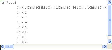
Set the Width property to specify the width of the input area of the control.
Look and Feel
To change the overall look and feel of the RadTreeView, set the Skin property.
To change the way the Nodes expand and collapse, use Animation.
To change the look of an individual item in RadTreeView, use the CssClass property and set up the CSS styles as needed.
To provide a right-to-left look and feel, set the attribute of the page HTML or set the dir attribute within a div tag.
To toggle the display of lines connecting Nodes, use the ShowLineImages property.
Changing the font size
To adjust the font sizes of all items in RadTreeView, you should use the following CSS rule:
.RadTreeView,
.RadTreeView a.rtIn,
.RadTreeView .rtEdit .rtIn input
{
   font-size:14px;
}
The declaration above increases the font size by 3px (since the default font size of RadTreeView is 11px).
Changing the spacing between tree Nodes
To change the space between RadTreeView Nodes, you should use the following CSS rules:
.RadTreeView .rtLI
{
    padding-bottom: 10px;
}
.RadTreeView .rtUL .rtUL
{
    margin-top: 10px;
}
.RadTreeView .rtLast
{
    padding-bottom: 0; /* prevent double-spacing */
}
The declaration above adds a 10px space between the Nodes.
Changing the Node lines
The Node lines of RadTreeView can be adjusted by modifying the following lines:
.RadTreeView .rtLines .rtLI
{
   background:url('TreeView/NodeSpan.gif') repeat-y 0 0;
}
.RadTreeView .rtLines .rtFirst
{
   background:url('TreeView/FirstNodeSpan.gif') no-repeat 0 1.273em;
}
.RadTreeView .rtLines .rtLast,
.RadTreeView .rtLines .rtLast .rtUL
{
   background:none;
}
.RadTreeView .rtLines .rtTop
{
   background:url('TreeView/TopLine.gif') 0 0 no-repeat;
}
.RadTreeView .rtLines .rtLast .rtTop
{
   background:url('TreeView/SingleLine.gif') 0 0 no-repeat;
}
.RadTreeView .rtLines .rtMid
{
   background:url('TreeView/MiddleLine.gif') 0 0 no-repeat;
}
.RadTreeView .rtLines .rtBot
{
   background:url('TreeView/BottomLine.gif') 0 0 no-repeat;
}
The images, referenced by this CSS, have the following meaning:
| Image file name | Purpose of image |
|---|---|
| TopLineMiddleLineBottomLine | The images for first item, for items between the first and the last, and for the last item.Their role is to add the line before each tree Node. |
| SingleLine | This image has the same role as the images, described above. Used only when there is only one root item (therefore no sibling Nodes and should be rendered differently) |
| FirstNodeFirstNodeSpan | Images, containing only vertical lines. Please note the difference, that FirstNodeSpan contains a very high image that is needed for the proper rendering of RadTreeView. |
It is advised to copy the line images from an existing skin and modify them, which will reduce image modification problems to a minimum.