Image
This help article illustrates how to put an image in a toggle state on a RadToggleButton.
To define an image in a RadToggleButton you should set the path to the image inside the Image.Url property of each toggle state (Example 1). You can also show text over the image by simply setting it in the Text property.
You can control the image dimensions through the Width and Height properties, which are exposed globally (the RadToggleButton object) as well as in each toggle state (the ButtonToggleState objects).
Figure 1: RadToggleButton with image.

Example 1: Configure images inside toggle states of RadToggleButton.
<telerik:RadToggleButton runat="server" ID="RadToggleButton1" Width="100px" Height="60px">
    <ToggleStates>
        <telerik:ButtonToggleState Selected="true">
            <Image Url="https://demos.telerik.com/aspnet-ajax/button/examples/togglebutton/images/volume/low.png" />
        </telerik:ButtonToggleState>
        <telerik:ButtonToggleState>
            <Image Url="https://demos.telerik.com/aspnet-ajax/button/examples/togglebutton/images/volume/high.png" />
        </telerik:ButtonToggleState>
        <telerik:ButtonToggleState>
            <Image Url="https://demos.telerik.com/aspnet-ajax/button/examples/togglebutton/images/volume/mute.png" />
        </telerik:ButtonToggleState>
    </ToggleStates>
</telerik:RadToggleButton>
The Background-size of the image is controlled through the Image.Sizing property.
If you add toggle states with and witout images, the RadToggleButton control will no longer be considered a button but a custom image. Thus, the borders and default backgrounds of the non-image toggle state will be lost and the appearance of the control will change.
Hovered, Active (Pressed) and Disabled States
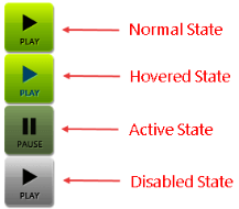
RadToggleButton also provides an easy way to show different images when the mouse is hovered over the control, the button is pressed or the button is disabled (see Figure 2 and Example 2). To do this, use the HoveredUrl, PressedUrl and DisabledUrl properties exposed by the Image tag of each toggle state.
Figure 2: A RadToggleButton can have different images for its normal, hovered, active (pressed) and disabled state.
Example 2: Setup unique images for the normal, hovered, active (pressed) and disabled state of a RadToggleButton.
<telerik:RadToggleButton runat="server" ID="RadToggleButton1" Width="58px" Height="59px">
    <ToggleStates>
        <telerik:ButtonToggleState Selected="true">
            <Image Url="https://demos.telerik.com/aspnet-ajax/button/examples/togglebutton/images/play/play.png" HoveredUrl="https://demos.telerik.com/aspnet-ajax/button/examples/togglebutton/images/play/playHov.png" PressedUrl="https://demos.telerik.com/aspnet-ajax/button/examples/togglebutton/images/play/pause.png" DisabledUrl="https://demos.telerik.com/aspnet-ajax/button/examples/imagebutton/images/cb_play_d.png" />
        </telerik:ButtonToggleState>
        <telerik:ButtonToggleState>
            <Image Url="https://demos.telerik.com/aspnet-ajax/button/examples/togglebutton/images/play/pause.png" />
        </telerik:ButtonToggleState>
    </ToggleStates>
</telerik:RadToggleButton>