Fine-tune Icons
This help article shows how to modify the position, size and color of icons in RadToggleButton.
Fine-tune Position
You can change the position of font or image icons to match your concrete requirements. To do this, use the Icon.Top and Icon.Left properties to directly offset the icon in the particular toggle state (Example 1).
Figure 1: The icon in RadToggleButton can be offset from its original top and left position. See Example 1.
Example 1: Offset RadToggleButton icon from the top and left. You can see the result in Figure 1.
<telerik:RadToggleButton ID="RadToggleButton1" runat="server" Text="Fine Tune Icon Position" Height="40px">
    <ToggleStates>
        <telerik:ButtonToggleState>
            <Icon CssClass="rbRefresh" Top="10px" Left="7px" />
        </telerik:ButtonToggleState>
        <telerik:ButtonToggleState>
            <Icon CssClass="rbSave" Top="10px" Left="7px" />
        </telerik:ButtonToggleState>
    </ToggleStates>
</telerik:RadToggleButton>
Configure Font-size and Color
The embedded RadToggleButton icons are font icons. Using a font facilitates the customization of the icons. For example, you can change the icon's color and font size with a single line of CSS (see Figure 2 and Example 2).
Figure 2: Customize the font size and color of the embedded icons of RadToggleButton with CSS.
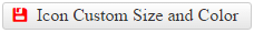
Example 2: Use CSS to modify the font size and color of the embedded icons in RadToggleButton.
<style type="text/css">
    button.RadButton.customizeIcon .rbPrimaryIcon:before {
        color: red;
        font-size: 17px;
    }
</style>
<telerik:RadToggleButton ID="RadToggleButton2" runat="server" Text="Icon Custom Size and Color" CssClass="customizeIcon">
    <ToggleStates>
        <telerik:ButtonToggleState>
            <Icon CssClass="rbSave" />
        </telerik:ButtonToggleState>
        <telerik:ButtonToggleState>
            <Icon CssClass="rbRefresh" />
        </telerik:ButtonToggleState>
    </ToggleStates>
</telerik:RadToggleButton>
This also applies for custom font icons.