Elastic Design
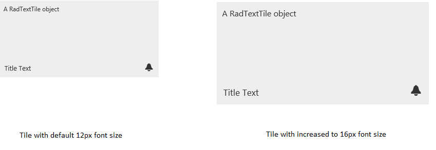
This article explains the elastic design capabilities RadTiles offer. The Lightweight RenderMode of each RadTile supports elastic design as of Q3 2015 (Figure 1).
Generally, responsive design means that the page and its content are able to adapt to different screen resolutions without deteriorating the user experience. This often includes changing the font size and having dimensions set in percent.
Figure 1: Comparison between the appearance of a RadTile with regular font size and with increased font size.

RadTiles do not create elastic design by themselves, but can fit in a page that follows this pattern. This means that their Lightweight RenderMode supports changing the font size without breaking the control's appearance - if the new size is larger than the original, the elements in the control will simply increase their size as well to accommodate the text. This fluid layout is achieved by using em units for setting dimensions and paddings in the control, instead of pxbecause em units are tied to the font size. This allows dimensions and sizes to scale with the font size.
As of 2016 Q1 SP1 RadTile takes the font-size of the page automatically. If the developer does not set it explicitly (Example 1), this is up to the client's browser and a common default value is 16px.
Example 1: Setting default font for the page with the default value for the Telerik controls.
body {
    font-size: 20px;
    font-family: "Segoe UI", Arial, Sans-serif;
}
Example 2: Changing the font-size of a Tile via page-level CSS rules.
body {
    font-size: 16px;
    font-family: "Segoe UI", Arial, Sans-serif;
}
<telerik:RadTextTile RenderMode="Lightweight" runat="server" ID="RadTextTile1" Selected="true" Text="A RadTextTile object" Shape="Wide">
    <Badge PredefinedType="Alert" />
    <Title Text="Title Text"></Title>
</telerik:RadTextTile>
You can apply the CSS rule to the Tile only, or to its container if you do not want to change the entire page.
Example 3: Changing the font-size of a Tile via the control's Font-Size property.
<telerik:RadTextTile RenderMode="Lightweight" Font-Size="16px" runat="server" ID="RadTextTile1" Selected="true" Text="A RadTextTile object" Shape="Wide">
    <Badge PredefinedType="Alert" />
    <Title Text="Title Text"></Title>
</telerik:RadTextTile>