Creating a Custom Skin
The following tutorial demonstrates creating a custom RadInput skin, using the default skin as a base. This new skin will take the appearance of the input controls from their default look:
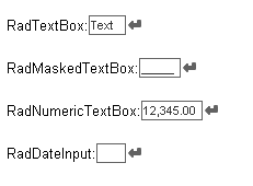
to the following:
See Understanding the Skin CSS File for more information on specific CSS file properties.
Prepare the Project
Drag a *RadTextBox control from the toolbox onto a new AJAX-enabled application Web form.
Set the properties of these input controls so that they each show a label and a button:
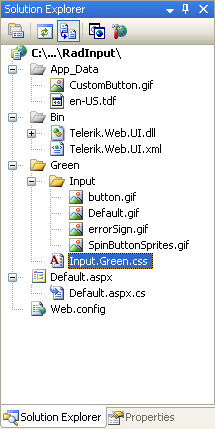
In the Solution Explorer, create a new "Green" directory in your project.
-
Copy the default RadInput skin files from the installation directory to the "Green" directory; copy both the \Input directory that contains the images for this skin and the Input.Default.css file that defines the skin styles.
The file path will typically be similar to this example: \Program Files\Progress\UI for ASP.NET AJAX RX YYYY\Skins\Default.
In the Solution Explorer, rename "Input.Default.css" to "Input.Green.css".
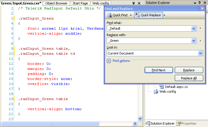
Open Input.Green.css and replace all instances of _Default with _Green. Then save the file:
-
Drag the "Input.Green.Css" file from the Solution Explorer onto your Web page. This automatically adds a reference to the page "
" tag as a "" to the new stylesheet: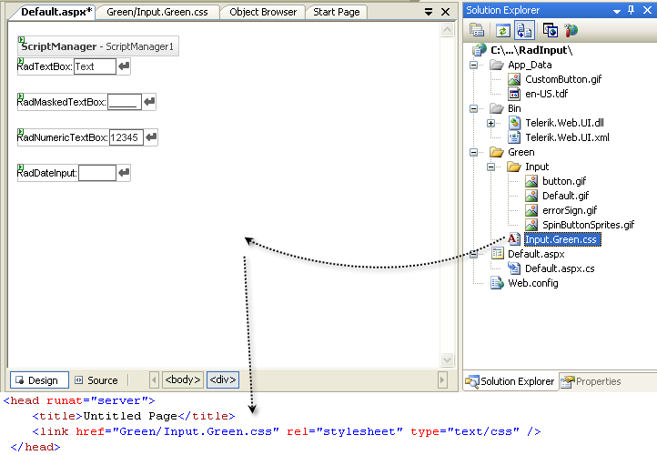
Change the Skin property of your four RadInput controls to "Green".
Set the EnableEmbeddedSkins property of your four RadInput controls to "False".
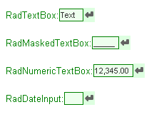
Run the application. The new "Green" skin looks just like the Default skin:
Editing the CSS classes
-
The classes that control the background for spin buttons are .riUp and .riDown. Locate the mentioned selectors. The class definitions are qualified by the .RadInput_Green class, which is the class definition for the entire control. Add a property to the selectors, setting the background color for the spin buttons:
    .RadInput_Green a.riUp
{
    background-position: 4px -98px;
    vertical-align: top;
    background-color: #ddffe0;
}
.RadInput_Green a.riDown { background-position: 4px -199px; vertical-align: top; background-color: #ddffe0; } -
The class that controls the background of the button is .riButton. There is currently no definition for this class in the skin file. Add one, setting a background for the button:
.RadInput_Green a.riButton { background-color: #ddffe0; } -
The text area when the control is enabled has the .riEnabled class applied. Locate this selector. Change the border color to Green and add a background color:
.RadInput_Green .riEnabled { color: #333; border: solid 1px Green; background:#eeffee; } -
The class that controls the text area when the mouse hovers over the control is .riHover. Locate this selector, and change the border color from "#000" to "Green".
.RadInput_Green .riHover { color: #333; border: solid 1px Green; } -
The class that controls the text area when it is displaying the empty message is .riEmpty. Locate this selector and change the color and border colors to "Green". Add in a background color as well:
.RadInput_Green .riEmpty { color: Green; border: solid 1px Green; background:#ddeedd; } -
The class that controls the text area when it has focus is .riFocused. Change the border color to "Green":
.RadInput_Green .riFocused { border: solid 1px Green; color: #000; } -
The class that controls the text area when it's value is invalid is .riError. Add a background-color of "#ddd", and change the color and border-color attributes to "#ffcc55":
.RadInput_Green .riError { background-image: url('Input/errorSign.gif'); background-position: center right; background-repeat: no-repeat; background-color:#ddd; border: solid 1px #ffcc55; color: #ffcc55; } -
The class that controls the Label is .riLabel. Change the font color to "Green":
    .RadInput_Green .riLabel
{
    color: Green;
    font-size: small;
    white-space:nowrap;
}
Run the application. The input controls should now look as follows: