Controlling Apparance
RadSwitch can be easily customized with the help of the standard CSS rules. In this demo you can see how to customize the default styles of the control in order to achieve the following layouts:
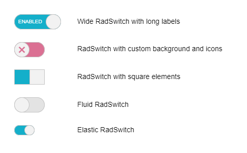
Long Labels
If you want to use long toggle state labels, you can make RadSwitch wider by setting its Width property:
Wide RadSwitch with long labels
<telerik:RadSwitch runat="server" ID="RadSwitch1" Checked="true" Width="92px" AutoPostBack="false">
    <ToggleStates>
        <ToggleStateOff Text="Disabled" />
        <ToggleStateOn Text="Enabled" />
    </ToggleStates>
</telerik:RadSwitch>
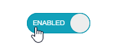
Custom Icons
Wide RadSwitch with long labels
/*Create RadSwitch with custom icons*/
button.RadSwitch.customIcons .k-switch-container .k-switch-handle, .RadSwitch:hover .k-switch-container .k-switch-handle {
    font-family: "WebComponentsIcons";
    text-align: center;
    color: inherit;
}

button.RadSwitch.customIcons.k-switch-on .k-switch-container .rbHovered,
button.RadSwitch.customIcons.k-switch-on:hover .k-switch-container {
    box-shadow: inset 0 0 0 1px seagreen;
}

button.RadSwitch.customIcons.k-switch-on .k-switch-container,
button.RadSwitch.customIcons.k-switch-on:hover .k-switch-container {
    color: lightgreen;
    background-color: lightgreen;
}

button.RadButton.customIcons.k-switch-on:hover .k-switch-handle,
button.RadButton.customIcons.k-switch-on.k-state-hover .k-switch-handle {
    border-color: seagreen;
}

button.RadSwitch.customIcons.k-switch-off .k-switch-container,
button.RadSwitch.customIcons.k-switch-off:hover .k-switch-container {
    color: palevioletred;
    background-color: palevioletred;
}

    button.RadSwitch.customIcons.k-switch-off .k-switch-container .rbHovered,
    button.RadSwitch.customIcons.k-switch-off:hover .k-switch-container {
        box-shadow: inset 0 0 0 1px brown;
    }

button.RadButton.customIcons.k-switch-off:hover .k-switch-handle,
button.RadButton.customIcons.k-switch-off.k-state-hover .k-switch-handle {
    border-color: brown;
}

.customIcons.k-switch-on .k-switch-handle:before {
    font-size: 2em;
    content: '\e118';
}

.customIcons.k-switch-off .k-switch-handle:before {
    font-size: 2em;
    content: '\e11b';
}
/*********************/
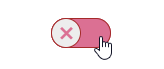
Square RadSwitch
Wide RadSwitch with long labels
/*Make RadSwitch square*/
button.RadSwitch.squareSwitch.k-switch,
button.RadSwitch.squareSwitch.k-switch .k-switch-container,
button.RadSwitch.squareSwitch.k-switch .k-switch-handle {
    border-radius: initial;
}
/*********************/
Fluid RadSwitch
/*Make RadSwitch fluid*/
.RadButton.RadSwitch.fluidSwitch {
    box-sizing: border-box;
}
/*********************/
Elastic RadSwitch
/*Make RadSwitch elastic*/
.RadButton.RadSwitch.elasticSwitch .k-switch-handle {
    width: 2em;
    height: 2em;
}

.RadButton.RadSwitch.k-switch-on.elasticSwitch .k-switch-handle {
    left: calc( 100% - 2em);
}

.RadButton.RadSwitch.elasticSwitch,
.RadButton.RadSwitch.elasticSwitch .k-switch-container {
    width: 4em;
}
/*********************/