Appearance
The Stepper is rendered horizontally with an indicator element and a label for each Step. The Stepper provides the possibility to customize all of these configurations.
Orientation
The orientation of the Stepper could be configured via the Orientation property which Indicates whether the Stepper will be rendered vertically or horizontally (default).
<telerik:RadStepper runat="server" ID="RadStepper1" Orientation="Vertical">
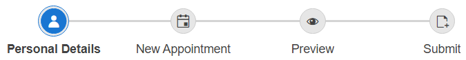
Horizontal (by default)
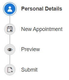
Vertical
Test how the Orientation property affects the Stepper in our Orientation demo.
Layout
By default both the Label and the Indicator(Icon) of each Step are displayed. The Stepper layout could be configured via the ShowLabel and ShowIndicator properties. By default both properties are enabled.
Based on the values set to the ShowLabel and ShowIndicator properties, three major layouts can be achieved:
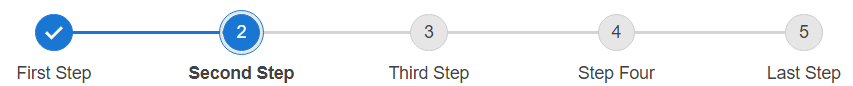
Labels and Indicators (default)
<telerik:RadStepper runat="server" ID="RadStepper1" ShowIndicator="true" ShowLabel="true">
Labels only
<telerik:RadStepper runat="server" ID="RadStepper1" ShowIndicator="false" ShowLabel="true">

Indicators only
<telerik:RadStepper runat="server" ID="RadStepper1" ShowIndicator="true" ShowLabel="false">

Check out the three options in our Layout live demo.