Fluid Design
This article explains the fluid design capabilities RadSplitButton offers. The Example 1 below shows how you can set button size in percent so it can resize with its parent element.
Generally, responsive design means that the page and its content are able to adapt to different screen resolutions without deteriorating the user experience. This often includes changing the font size and having dimensions set in percent.
Figure 1: RadSplitButton occupying 100% of its parent's width.
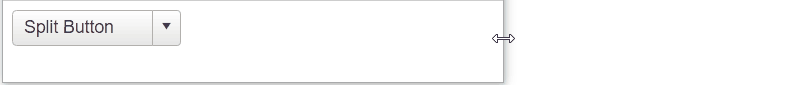
Example 1: Shows the markup that provides fluid design of the RadSplitButton in Figure 1.
<div style="width: 30%;">
    <telerik:RadSplitButton runat="server" ID="RadSplitButton" Text="Split Button" Width="100%">
        <ContextMenu>
            <Items>
                <telerik:RadMenuItem Text="Action 1"></telerik:RadMenuItem>
                <telerik:RadMenuItem Text="Action 2"></telerik:RadMenuItem>
                <telerik:RadMenuItem Text="Action 3"></telerik:RadMenuItem>
            </Items>
        </ContextMenu>
    </telerik:RadSplitButton>
</div>