Elastic Design
This article explains the elastic design capabilities RadSplitButton offers. The Example 1 below shows the basic approaches you can use to scale the control by only changing its default font size.
Generally, responsive design means that the page and its content are able to adapt to different screen resolutions without deteriorating the user experience. This often includes changing the font size and having dimensions set in percent.
Figure 1: Comparison between appearance of a RadSplitButton with regular font size and with increased font size.
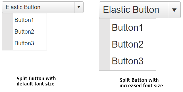
How to increase the font size of a RadSplitButton as shown in Figure 1.
body .RadButton,
body .RadMenu_Context {
    font-size: 26px;
}
    body .RadButton .rbSplitIcon {
        vertical-align: middle;
    }
    body .RadButton .rbIcon:before {
        font-size: 26px;
    }
<telerik:RadSplitButton runat="server" ID="RadSplitButton1" Text="Elastic Button" Width="230px">
    <ContextMenu>
        <Items>
            <telerik:RadMenuItem Text="Button1"></telerik:RadMenuItem>
            <telerik:RadMenuItem Text="Button2"></telerik:RadMenuItem>
            <telerik:RadMenuItem Text="Button3"></telerik:RadMenuItem>
        </Items>
    </ContextMenu>
</telerik:RadSplitButton>