Controlling Appearance
There are a number of ways to customize the look and feel of RadSlider:
To change the overall look and feel of the RadSlider control, set its Skin property.
To change the layout of RadSlider, use the Orientation property.
To change the visibility of handles, use the ShowDragHandle, ShowDecreaseHandle and ShowIncreaseHandle properties.
To show two drag handles use the IsSelectionRangeEnabled property
To reverse the slider set the IsDirectionReversed property to true
To Disable the slider set the Enabled property to false
Visual Examples:
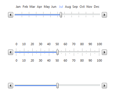
Horizontal Slider:

From top to bottom: Slider with Items, Slider with Ticks, Slider
Reversed Horizontal Slider:

From top to bottom: Slider with Items, Slider with Ticks, Slider
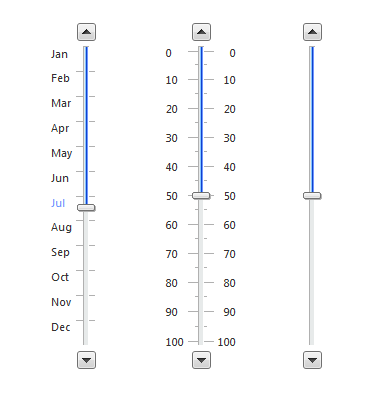
Vertical Slider

From left to right: Slider with Items, Slider with Ticks, Slider
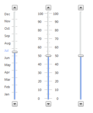
Vertical Slider Reversed

From left to right: Slider with Items, Slider with Ticks, Slider
Slider with two Drag Handles

Disabled Slider
