Getting Started Overview
This help article illustrates how to configure a RadRotator control.
RadRotator Basic Configuration
To configure a rotator control you can follow the steps below:
Add the control on the page. You can simply drag and drop it from the Visual Studio Toolbox. Please note that it requires an asp:ScriptManager to be declared on the page as well.
Add a data source control and set the RadRotator's DataSourceID property to its ID.
Declare the ItemTemplate's content.
It is recommended that if you want to declare multiple elements inside the rotator's ItemTemplate, you should add a div that wraps the content in the ItemTemplate and set a class to that div. The width and height CSS properties applied through this class should be synchronized with the values set to the RadRotator's
ItemWidthandItemHeightproperties. The margin and padding of the elements declared inside theItemTemplateshould be taken into account as well.Set the Width, ItemWidth, Height and ItemHeight properties. You can refer to the next section, (RadRotator Dimensions Configuration), for details on the matter.
RadRotator Dimensions Configuration
RadRotator is a dynamic control that moves its content. To do that the control should be "aware" of its item's size. The ItemWidth and ItemHeight properties are intended to provide this information to the control. If these properties are not set accordingly in the ItemTemplate's size, then the RadRotator may behave inconsistently in different browsers.
The items are not shown when the control is first loaded. After clicking the "Refresh" button the items become visible.
Rotator shows only a part of a loaded item (the items are not synchronized).
A gap occurs between the item like an empty item.
Rotator does not rotate its content.
This example below demonstrates the purpose of the Width, ItemWidth, Height and ItemHeight properties:
<telerik:RadRotator RenderMode="Lightweight" ID="RadRotator1" runat="server" Width="200" ItemWidth="100" Height="100"
    ItemHeight="100" DataSourceID="XmlDataSource1" FrameDuration="1000">
    <ItemTemplate>
        <asp:Image CssClass="itemTemplate" ID="Image1" runat="server" ImageUrl='<%# XPath("ImageURL") %>'
            AlternateText="IMAGE" />
    </ItemTemplate>
</telerik:RadRotator>
- This is the implementation of the itemTemplate class:
.itemTemplate
{
    width: 100px;
    height: 100px;
}
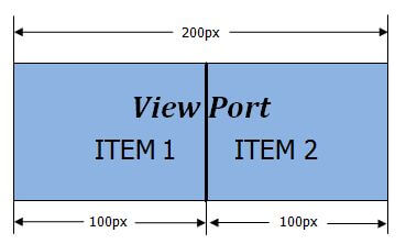
After implementing the above steps, two items will be shown in the RadRotator's viewport, because of the Width="200" and ItemWidth="100" properties.
In the case that the requirement is to show 3 items in the viewport, then the Width property should be changed to "300". Also, if one of the RadRotator's buttons' type is used, then the buttons' size should be added to the rotator's Width property. For example if the button is 30x30 then the width should be 360. You can find more information in the article, How To Configure Size of Rotator with Buttons.
All of the explained logic stays the same if the ScrollDirection="Up, Down" is set, but it should be applied to the Height and ItemHeight properties, respectively.