Adaptive Behavior
The following article described the adaptive behavior of the RadNavigation control
The RadNavigation control features responsive behavior, providing built-in support for both desktop and mobile browsers, with no need for RenderMode property changes. The rendered html remains the same, while control's appearance is changed by CSS and JavaScript. When there is not enough space for all nodes to be displayed, some of them will become part of the sandwich-like button.
The button could be displayed at the leftmost or rightmost side of the RadNavigation control. This feature could be managed by the MenuButtonPosition property, which accepts two values : Left and Right.
To force your content to appear at a maximum width of the device within the browser viewport and prevent horizontal scrolling on a full-screen browser, add the meta-viewport tag to the header of your pages:
<meta name="viewport" content="width=device-width, initial-scale=1.0" />
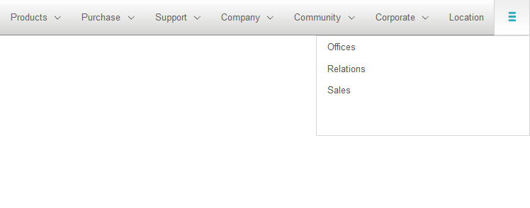
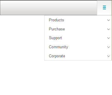
In the figures below, you can observe how the layout of the RadNavigation changes, regarding the size of the browser. In Figure 1, there is enough space to display some nodes in the RadNavigation and some under the sandwich-like button,while in Figure 2 all nodes are paced under the button.
Figure 1: Some nodes are placed under the sandwich-like button

Figure 2: All nodes are placed under the sandwich-like button
