Creating Custom Skin
Valid for 2008 Q3 version and below, for any other please refer to Creating A Custom Skin Using Sprite
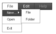
The following tutorial demonstrates creating a custom RadMenu skin, using the default skin as a base. This new skin will take the appearance of the menu from its default look:

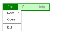
to the following:

See Understanding the Skin CSS File for more information on specific CSS file properties.
<div id="Div1" class="RadMenu RadMenu_Green ">
  <ul class="rmHorizontal rmRootGroup">
    <li class="rmItem rmFirst">
      <a href="#" class="rmLink ">
        <span class="rmText">File</span>
      </a>
      <div class="rmSlide">
        <ul class="rmVertical rmGroup rmLevel1">
          <li class="rmItem rmFirst">
            <a href="#" class="rmLink ">
              <span class="rmText">New...</span>
            </a>
            <div class="rmSlide">
              <ul class="rmVertical rmGroup rmLevel2">
                <li class="rmItem rmFirst">
                  <a href="#" class="rmLink ">
                     <span class="rmText">File</span>
                  </a>
                </li>
                <li class="rmItem rmLast">
                  <a href="#" class="rmLink ">
                    <span class="rmText">Folder</span>
                  </a>
                </li>
              </ul>
            </div>
          </li>
          <li class="rmItem">
            <a href="#" class="rmLink ">
              <span class="rmText">Open</span>
            </a>
          </li>
          <li class="rmItem rmSeparator ">
            <span class="rmText"></span>
          </li>
          <li class="rmItem rmLast">
            <a href="#" class="rmLink ">
              <span class="rmText">Exit</span>
            </a>
          </li>
        </ul>
      </div>
    </li>
    <li class="rmItem">
      <a href="#" class="rmLink ">
        <span class="rmText">Edit</span>
      </a>
    </li>
    <li class="rmItem rmLast">
      <a href="#" class="rmLink rmDisabled ">
        <span class="rmText">Help</span>
      </a>
    </li>
  </ul>
  <input id="RadMenu1_ClientState" name="RadMenu1_ClientState" type="hidden" />
</div>
The control is rendered as a DIV element with the class "RadMenu RadMenu_Green". The item hierarchy is presented as nested unordered lists with links inside, all containing nested class attributes.
Here is a more detailed breakdown of the rendered markup:
Root tag
The menu is rendered as a DIV tag. Here is an excerpt from the example above:
<div id="RadMenu1" class="RadMenu RadMenu_Green ">
    <!-- menu content goes here -->
</div>
The ID attribute of the DIV tag is set to the ClientID property of the RadMenu control. As you can see two CSS classes have been applied: "RadMenu" and "RadMenu_Green". The "RadMenu" class is always applied. It defines the basic presentation of the menu which is common for all skins. The "RadMenu_Green" class is applied because the Skin of the menu is set to "Green". If the the menu does not use a skin (the Skin property is set to "") only the "RadMenu" CSS class would be rendered.
If you set the Style or CssClasss property of the RadMenu control they would be applied to the root menu tag:
<telerik:RadMenu RenderMode="Lightweight" runat="server" ID="RadMenu1" Skin="Green" CssClass="MyMenu" Style="position: relative; z-index: 1000">
Root item group
The root item group renders as a UL (unordered list)tag:
<ul class="rmHorizontal rmRootGroup">
    <!-- root elements and their children go here -->
</ul>
It has two CSS classes applied: "rmHorizontal" and "rmRootGroup". The "rmHorizontal" class is applied because the Flow of the RadMenu is horizontal by default. If it were vertical that CSS class would be "rmVertical". The "rmRootGroup" CSS class is always rendered.
Menu items
RadMenuItem renders as a LI (list item) tag, containing an A (link or anchor) tag. The text of the item is rendered inside a SPAN tag:
<li class="rmItem">
    <a href="#" class="rmLink ">
        <span class="rmText">Edit</span>
    </a>
    <!-- child items go here -->
</li>
The LI tag has its class attribute always set to "rmItem". The A tag has its class attribute always set to "rmLink". The SPAN tag has its class attribute always set to "rmText". If the Style or CssClass properties of the RadMenuItem class are set they are applied to the A tag.
If the item is the first child of its parent, the LI tag also has the "rmFirst" CSS class applied:
<li class="rmItem rmFirst">
    <a href="#" class="rmLink ">
        <span class="rmText">File</span>
    </a>
    <!-- child items go here -->
</li>
If the item is the last child of its parent, the LI tag has the "rmLast" CSS class applied:
<li class="rmItem rmLast">
    <a href="#" class="rmLink rmDisabled ">
        <span class="rmText">Help</span>
    </a>
</li>
Note that in this example, the item is disabled, so the A tag has the "rmDisabled" class applied as well as the "rmLink" class.
If an item is the only child of its parent it has both the "rmFirst" and "rmLast" CSS classes.
If the item is a separator (its IsSeparator property is True), the LI tag gets the "rmSeparator" class applied. Because separators do not respond to user clicks, it has no A element:
<li class="rmItem rmSeparator ">
    <span class="rmText"></span>
</li>
Item States
The Last Menu Item example showed a disabled item with the "rmDisabled" class applied to the A tag. Other item states also result in additional CSS classes applied to the A tag:
Focused items: An item is focused when clicked or when it is selected with the keyboard (by using the TAB key or a shortcut - access key). When an item is focused one additional CSS class - "rmFocused" is applied to the A tag.
Expanded items: An item is expanded when the user hovers it with the mouse. When an item is expanded one additional CSS class - "rmExpanded" is applied to the A tag.
Clicked items: An item is clicked when the user clicks it with the mouse and keeps the mouse button pressed. When an item is in clicked state one additional CSS class - "rmClicked" is applied to the A tag. When the user releases the mouse button, the "rmClicked" CSS class is removed. This CSS class is useful to visually show that a menu item is clicked.
Child item groups
If the item has children they are rendered in an UL tag within the LI tag of their parent item:
<div class="rmSlide">
    <ul class="rmVertical rmGroup rmLevel1">
        <!-- child items go here -->
    </ul>
</div>
The DIV tag whose class attribute is set to "rmSlide" is used by the animation effects. It is not related with the final appearance and can be ignored.
The child item group has three CSS classes applied: "rmVertical", "rmGroup" and "rmLevel1". The "rmVertical" class is applied because the default item flow for child items is vertical. If it were horizontal (GroupSettings-Flow="Horizontal") that class would have been "rmHorizontal". The "grGroup" class is always applied for child item groups. The "rmLevel1" class is applied for all level 1 item groups. Root items are considered as level 0, their children are level 1, their children's children are level 2 and so on.
Graphic representation of CSS Classes in the HTML output
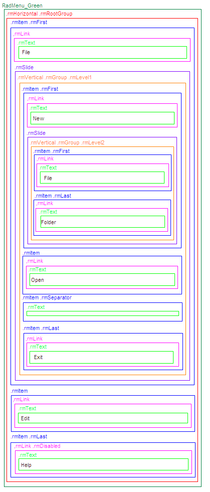
The following diagram shows a symbolic view of the CSS classes in the rendered menu:
