Donut Chart
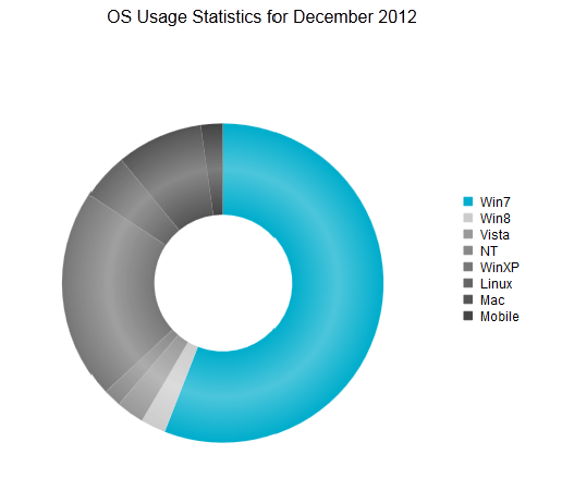
The Donut chart, as part of the ASP NET AJAX Chart, displays data as sectors from a circle and is therefore useful for displaying data as parts of a whole. A Donut chart is a Pie chart variation with the ability to display single series of data in a two-dimensional circle. This help article will describe how to customize a Donut chart and provides code in Example 1 that shows how to create Figure 1.
Figure 1: A simple example of a Donut chart.

You can customize a Donut chart.
The color is controlled via the BackgroundColor property of the PieSeriesItem.
You can fine tune the diameter of the donut hole via the
HoleSizeproperty exposed by theDonutSeries.The name that is shown in the legend is set via the
Nameproperty of the series item. You can hide the series item from the legend either by omitting it, or by setting theVisibleInLegendproperty tofalse.Whether the sector is separated from the rest of the circle is controlled via the Exploded property of the PieSeriesItem. This and the Pie chart are the only chart types in whose context the Exploded property is meaningful and will have effect.
-
How big of a section of a Donut chart is is controlled by its Y property of the PieSeriesItem and its relation to the other items' value.
Only positive values have meaning in the context of a Donut chart and the developer must make sure that positive value data is passed to the chart.
Each item can have a label and a tooltip that follow the common pattern defined in the DataFormatString property of the LabelsAppearance and TooltipsAppearance sections of the series. The format string uses the Y of the item. You can also load custom text from data source fields in labels and tooltips by using the composite ClientTemplate property.
The title, background colors and legend are controlled via the inner properties of the RadHtmlChart control and are common for all charts. You can find more information in the Server-side API and in the Element structure articles.
The Donut chart in Figure 1 is created with the code in Example 1.
Example 1: Creating the simple Donut chart in Figure 1 using hard coded data.
<telerik:RadHtmlChart runat="server" ID="DonutChart" Width="500" Height="500" Transitions="true">
    <Appearance>
        <FillStyle BackgroundColor="White"></FillStyle>
    </Appearance>
    <ChartTitle Text="OS Usage Statistics for December 2012">
        <Appearance Align="Center" Position="Top"></Appearance>
    </ChartTitle>
    <PlotArea>
        <Series>
            <telerik:DonutSeries HoleSize="50">
                <LabelsAppearance Visible="false">
                </LabelsAppearance>
                <TooltipsAppearance DataFormatString="{0}%" BackgroundColor="White"></TooltipsAppearance>
                <SeriesItems>
                    <telerik:PieSeriesItem BackgroundColor="#00adcc" Name="Win7"
                        Y="55.6"></telerik:PieSeriesItem>
                    <telerik:PieSeriesItem BackgroundColor="#cccccc" Name="Win8" Y="2.5"></telerik:PieSeriesItem>
                    <telerik:PieSeriesItem BackgroundColor="#999999" Name="Vista" Y="2.8"></telerik:PieSeriesItem>
                    <telerik:PieSeriesItem BackgroundColor="#888888" Name="NT" Y="1.8"></telerik:PieSeriesItem>
                    <telerik:PieSeriesItem BackgroundColor="#777777" Name="WinXP" Y="21.1"></telerik:PieSeriesItem>
                    <telerik:PieSeriesItem BackgroundColor="#666666" Name="Linux" Y="4.7"></telerik:PieSeriesItem>
                    <telerik:PieSeriesItem BackgroundColor="#555555" Name="Mac" Y="8.7"></telerik:PieSeriesItem>
                    <telerik:PieSeriesItem BackgroundColor="#444444" Name="Mobile" Y="2.2"></telerik:PieSeriesItem>
                </SeriesItems>
            </telerik:DonutSeries>
        </Series>
    </PlotArea>
</telerik:RadHtmlChart>
The Donut chart does not have axes as they are not applicable in its context.