Grouping
Basic Grouping
The grouping functionality of the Adaptive RadGrid control has the following characteristics:
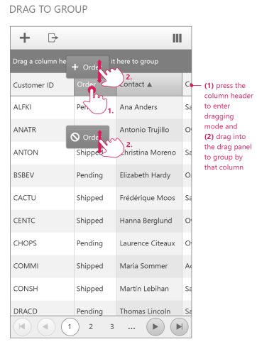
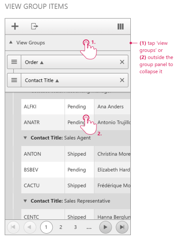
The group panel item always renders as part of the table header below the command item and above the column headers (this is only valid for RenderMode set to "Mobile"). You will expand the group view when you click anywhere in the row with the "View Groups" pointer. If you click outside the group panel, the group view will be collapsed. In case you set the "ShowUnGroupButton" property of the grid control to "true", a close button will render next to each group item. (screenshot)
The grid has a separate gridGrouPanelItem, which you can access and modify on the server as any other item in the grid
The GroupPanel property (both server and client-side) is obsolete when RenderMode is set to "Mobile". If you are using it, it will not give any effect
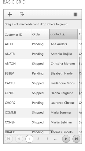
When the grid is not grouped the default text in the groupPanelItem is "Drag a column header and drop it here to group"
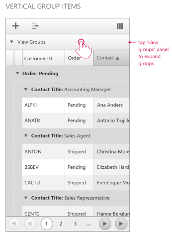
When the grid gets grouped – you see only an arrow pointing down and the text "View Groups"
Drag to group action works the same way as before – you drag a column header and drop it on the group panel item. It will not be visible in the group panel item. The group items can be dragged and reordered only by using the icon in the left part of the item (image). When the "AllowDragToReorder" property is set to "false" the mentioned icon will not be visible.