Customizing Row Appearance
When you apply one of the external grid skins shipped with the installation, you will need to alter the corresponding classes inside the Skins/[Skins_Name]/[Control].[SkinName].css file (see this documentation topicfor more details). This article information is applicable when you prefer not to use the skinning mechanism of Telerik RadGrid (choosing Skin="").
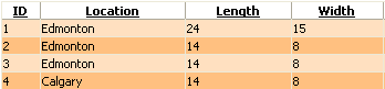
Normal Item
These are the odd rows of the grid (rows 1 and 3 on the picture below).The appearance of the normal rows is controlled by the ItemStyle property.
Alternating Item
These are the even rows of the grid (rows 2 and 4 on the picture below).The appearance of the alternating rows is controlled by the AlternatingItemStyle property.
You can set the appearance of the normal and alternating rows programmatically or in the grid declaration:
Example:
<telerik:RadGrid RenderMode="Lightweight" runat="server" ... />
<AlternatingItemStyle BackColor="Orange" ... />
<ItemStyle BackColor="White" ... />
Dim RadGrid1 As RadGrid = New RadGrid()
RadGrid1.AlternatingItemStyle.BackColor = Color.Orange
RadGrid1.ItemStyle.BackColor = Color.White
RadGrid RadGrid1 = new RadGrid();
RadGrid1.AlternatingItemStyle.BackColor = Color.Orange;
RadGrid1.ItemStyle.BackColor = Color.White;
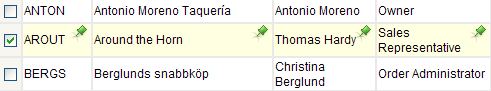
Selected Item
You can customize the appearance of the selected row, using the SelectedItemStyle property:
<style type="text/css">
 .SelectedItem
 {
  background-image: url(img/SelectedRow.gif);
  background-repeat: no-repeat;
  background-position: top right;
 }
</style>

<telerik:radgrid id="RadGrid1" cssclass="RadGrid" runat="server" allowpaging="True" allowsorting="True"
 pagesize="10" width="95%" showfooter="True" allowmultirowselection="True">
...
 <selecteditemstyle CssClass="SelectedItem"></selecteditemstyle>
 <mastertableview Width="100%" CssClass="MasterTable" style="border-collapse:separate;">
  <rowindicatorcolumn uniquename="RowIndicator">
   <headerstyle width="20px"></headerstyle>
  </rowindicatorcolumn>
  <columns>
   <telerik:gridtemplatecolumn groupable="False" uniquename="TemplateColumn">
    <headerstyle width="20px"></headerstyle>
    <ItemStyle CssClass="ResizeItem"></ItemStyle>
    <itemtemplate>
     <asp:checkbox id="CheckBox1" autopostback="False" runat="server"></asp:checkbox>
    </itemtemplate>
   </telerik:gridtemplatecolumn>
  </columns>
  <expandcollapsecolumn buttontype="ImageButton" visible="False" uniquename="ExpandColumn">
   <headerstyle width="19px"></headerstyle>
  </expandcollapsecolumn>
 </mastertableview>
</telerik:radgrid>
Edit Item
You can customize the appearance of the selected row, using the EditItemStyle property:
            <style type="text/css">
     .EditedItem, .EditedItem TABLE TR
     {
      background-color: #ffffe1;
      background-image: none;
     }
     .EditRow TD
     {
      border-bottom: 1px solid #d9d6cf;
     }
    </style>

    <telerik:RadGrid RenderMode="Lightweight" id="RadGrid1" CssClass="RadGrid" runat="server" AllowPaging="True" AllowSorting="True" PageSize="10" Width="95%" ShowFooter="True" GridLines="None">
     <Columns>
      <telerik:GridEditCommandColumn ButtonType="LinkButton" UpdateText="Update" CancelText="Cancel" EditText="Edit">
       <HeaderStyle Width="37px"></HeaderStyle>
       <ItemStyle CssClass="ResizeItem"></ItemStyle>
      </telerik:GridEditCommandColumn>
     </Columns>
     <EditItemStyle CssClass="EditedItem" Height="25px"></EditItemStyle>
     <MasterTableView>
      <EditFormSettings CaptionFormatString='<img src="img/editRowBg.gif" alt="" />'>
       <FormMainTableStyle GridLines="None" CellSpacing="0" CellPadding="3" Width="100%" CssClass="none"/>
        <FormTableStyle CssClass="EditRow" CellSpacing="0" BorderColor="#c4c0b5" CellPadding="2" Width="100%"/>
        <FormStyle Width="100%" BackColor="#ffffe1"></FormStyle>
      </EditFormSettings>
     </MasterTableView>
    </telerik:RadGrid>
