Axes
RadChart has been replaced by RadHtmlChart, Telerik's client-side charting component. If you are considering RadChart for new development, examine the RadHtmlChart documentation and online demos first to see if it will fit your development needs. If you are already using RadChart in your projects, you can migrate to RadHtmlChart by following these articles: Migrating Series, Migrating Axes, Migrating Date Axes, Migrating Databinding, Features parity. Support for RadChart is discontinued as of Q3 2014, but the control will remain in the assembly so it can still be used. We encourage you to use RadHtmlChart for new development.
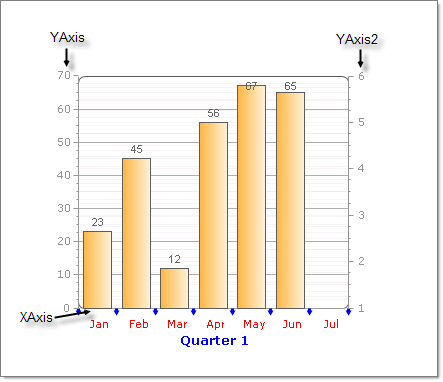
X and Y axes are included in all chart types but the Pie chart. Typically the YAxis displays values and the XAxis displays categories.For example, the YAxis might show "items sold" or "revenue", while the XAxis might show "Months" or "Products". The X axis can also display values. A second "Y" axis property YAxis2 is provided for displaying a second scale of measurements.

Axis Elements
Each axis has:
Grid lines display perpendicular to the axis covering the plot area.
Axis line
Axis label
Axis marks along the axis line
Item labels below the axis line
The example below shows a sample X-axis with several appearance related properties customized.

The RadChart PlotArea property has sub properties XAxis, YAxis and YAxis2. Each axis object has an Appearance property used to make the customizations shown above.Some significant axis appearance related properties are:
The LabelAppearance property includes sub properties that control the axis label visibility, Border, Corners, Dimensions, FillStyle, Position and Shadow.
MajorGridlines controls the appearance of grid lines displaying over the plot area including visibility, Cap, Color, PenStyle and Width.
TextAppearance handles the axis item label text, most notably TextAppearance.TextProperties controls font properties and color.
Axis properties can be set from the Properties Window of Visual Studio, in the XML configuration file, or through the API. Properties for the X and Y axis are identical except where noted.
Formatting Axis
You can modify the overall appearance of an axes by changing the AutoScale and AutoShrink properties.These properties when set to true cause the axis to expand and shrink to accommodate dynamically added and removed items. This is useful when the number of items changes on-the-fly.
Turn AutoScale off if you want complete control over labeling of an axis.
Formatting Axis Labels

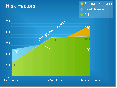
To display a range of values along an axis, specify for the ChartAxis a starting MinValue, an ending MaxValue, and a Step. In the example above, the YAxis has a MinValue of "0", a MaxValue of "250" and a Step of "50." The X axis is labeled explicitly by setting PlotArea.XAxis properties:
AutoScale = False
MaxValue = 3
MinValue = 1
Step = 1
Visible = True
Items is populated with with 3 ChartAxisItem objects where the Appearance.Text property contains "Non-Smokers", "Social Smokers" and "Heavy Smokers".
You can control the size and position of the labels using the axis Appearance.LabelAppearance Dimensions and Position properties.
Unique YAxis and YAxis2 Properties
AxisMode: AxisMode can be Normal (the default) or Extended. Extended mode provides buffer space above the largest value for best visual formatting.
ScaleBreaks: The ScaleBreaks feature allows you to "break off" large chunks of the axis so that graphs with large amplitude are easier to read. ScaleBreaks are available for both YAxis and YAxis2 of the plot area. By default Enabled is false so scale breaks do not display. Set the maximum number of breaks using MaxBreaks and MinCollapsibleSpace to set the minimum interval between data points before a break will occur. For the lines that make up each break, Spacing controls the amount of space between lines and LineType controls the shape of the line (i.e. Sinusoid, Straight, JaggedCurve and Curve).