Structure
The structure of the RadBreadcrumb control is as follows:
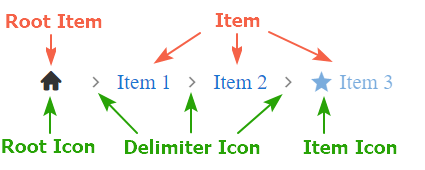
The Breadcrumb consists of items separated by a DelimiterIcon. The items are represented as BreadcrumbItem instances. Each of them can hold Icon, Text, navigational URL (Href), and custom attributes.
Two types of items are exposed - RootItem and Item:
- The RootItem by default is rendered as a clickable icon - the Root Icon.
- Each Item by default is rendered with its text only. Items can also have their own icons - Item Icon.
More detailed information about the items and icons in RadBreadcrumb you can find in the respective documentation articles: