Icons
The Breadcrumb allows configuring the icons of the items and the delimiters. All the built-in icons distributed with Telerik UI for ASP.NET AJAX suite can be used in RadBreadcrumb.
In addition, all the Kendo UI Web Font Icons are also available for using in the component.
To include a desired embedded icon use the exposed icon properties - RootIcon, DelimiterIcon of the RadBreadcrumb, or Icon and IconClass of each BreadcrumbItem.
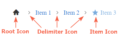
Figure 1:
Root Icon
The root icon is the icon rendered in the RootItem. It is clickable and resets the value of the component when clicked.
Figure 2:
By default the RootIcon is visible. It can be hidden by setting the
ShowIconproperty of the RootItem to 'false'
The icon of the RootItem can be set via the RootIcon property of the RadBreadcrumb like shown in Figure 2 above:
<telerik:RadBreadcrumb runat="server" ID="RadBreadcrumb1" RootIcon="user">
    <Items>
        <telerik:BreadcrumbItem Type="RootItem" ToolTip="My Profile" />
        <telerik:BreadcrumbItem Text="Settings" />
        <telerik:BreadcrumbItem Text="Security" />
    </Items>
</telerik:RadBreadcrumb>
The same result can be achieved by setting the Icon property of the respective BreadcrumbItem
<telerik:RadBreadcrumb runat="server" ID="RadBreadcrumb1">
    <Items>
        <telerik:BreadcrumbItem Type="RootItem" ToolTip="My Profile" Icon="user" />
        <telerik:BreadcrumbItem Text="Settings" />
        <telerik:BreadcrumbItem Text="Security" />
    </Items>
</telerik:RadBreadcrumb>
In case the RootIcon is not set explicitly, it gets its default value - "home"
If different icons are set to the
RootIconproperty of the RadBreadcrumb and to theIconproperty of BreadcrumbItem with type RootItem, the one set to the Item takes effect.
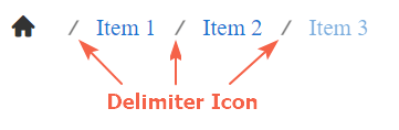
Delimiter Icon
The delimiter icon is the icon rendered between the items in the Breadcrumb. It can be set via the DelimiterIcon property of the Breadcrumb. Check out the sample declaration and Figure 3 below:
<telerik:RadBreadcrumb runat="server" ID="RadBreadcrumb2" DelimiterIcon="divide">
    <Items>
        <telerik:BreadcrumbItem Type="RootItem" />
        <telerik:BreadcrumbItem Text="Item 1" />
        <telerik:BreadcrumbItem Text="Item 2" />
        <telerik:BreadcrumbItem Text="Item 3" />
    </Items>
</telerik:RadBreadcrumb>
Figure 3:
Item Icon
The icons rendered for each item. It is also clickable and can be configured through the Icon property of BreadcrumbItem.
By default, the Item icon is not visible (despite for RootItems). To show the icon for an item set its ShowIcon property to 'true', like demonstrated below:
<telerik:RadBreadcrumb runat="server" ID="RadBreadcrumb1" >
    <Items>
        <telerik:BreadcrumbItem Type="RootItem" />
        <telerik:BreadcrumbItem Text="Item 1" Icon="folder-open" ShowIcon="true" />
        <telerik:BreadcrumbItem Text="Item 2" Icon="star" ShowIcon="true" />
        <telerik:BreadcrumbItem Text="Item 3" Icon="circle" ShowIcon="true"/>
    </Items>
</telerik:RadBreadcrumb>
Figure 4:
Use Class names to apply icons
In case the name of a desired icon is not part of the predifined built-in icons, you can use the icon properties and set a Class name instead.
To set a Class name for the
RootIconandDelimiterIconRadBreadcrumb properties, or for theIconproperty of a BreadcrumbItem you need to set the desired Class name with a foregoing whitespace character(e.g. RootIcon=" k-i-globe-outline").
We can use that approach to apply a desired Kendo Web Font Icon in RadBreadcrumb like demonstrated in the figure below:
Figure 5:
We would need to get the Unicode of the desired icon from the Kendo Icons page and set it as content of the before pseudo-element.
The declaration of the Breadcrumb shown in Figure 5:
<style>
    .k-i-arrow-right:before {
        content: "\e018";
    }

    .k-i-globe-outline:before {
        content: "\e700";
    }

    .k-i-attachment.k-i-clip:before {
        content: "\e10d";
    }
</style>

<telerik:RadBreadcrumb runat="server" ID="RadBreadcrumb2" DelimiterIcon=" k-i-arrow-right" RootIcon=" k-i-globe-outline">
    <Items>
        <telerik:BreadcrumbItem Type="RootItem" />
        <telerik:BreadcrumbItem Text="Item 1" />
        <telerik:BreadcrumbItem Text="Item 2" />
        <telerik:BreadcrumbItem Text="Item 3" ShowIcon="true" Icon=" k-i-attachment k-i-clip" />
    </Items>
</telerik:RadBreadcrumb>
For Item icons, another way to achieve the same is to set the k-icon class to the IconClass property followed by the icon class names:
<telerik:BreadcrumbItem Text="Item 3" ShowIcon="true" IconClass="k-icon k-i-attachment k-i-clip" />
Find more about the usage of the IconClass property in the next section.
Use the IconClass
The IconClass property of RadBreadcrumb defines additional classes that will be applied to the <span> containing the font icon. That way each icon can be reached and styled separately.
Sample usage of the IconClass property is shown in Figure 6 below:
Figure 6:
And the code to achieve this appearance:
<telerik:RadBreadcrumb runat="server" ID="RadBreadcrumb2" Skin="Silk" >
    <Items>
        <telerik:BreadcrumbItem Type="RootItem" IconClass="largeGreenIcon" />
        <telerik:BreadcrumbItem Text="Controls" ShowIcon="true" Icon="folder-open"  />
        <telerik:BreadcrumbItem Text="RadBreadcrumb" />
        <telerik:BreadcrumbItem Text="Functionality" ShowIcon="true" Icon="folder-open" />
        <telerik:BreadcrumbItem Text="Items" Icon="star" ShowIcon="true" IconClass="largeGreenIcon" />
    </Items>
</telerik:RadBreadcrumb>
<style>
    .largeGreenIcon {
        font-size: 2em;
        color: green;
    }
</style>
Go ahead and test the Icons live demo.
In case you want to replace the built-in icons with external ones, check out How to Integrate RadBreadcrumb with FontAwesome icons