Change the expand/collapse icons in a Hierarchical Grid
Environment
| Product | Grid for Blazor |
Description
How to change the expand/collapse icons in a Hierarchical Grid? I want to change the built-in plus/minus icons in a Hierarchical Grid.
Solution
You can change the expand/collapse icons in the Hierarchical Grid by overriding the built-in plus/minus icons with other icons using custom CSS rules. In addition, you can use the Class parameter of the Grid to add custom CSS Class and modify a specific instance of the Grid, instead of all instances on the page. The code block below demonstrates how to achieve the described approach.
@*Change the icons in the Hierarchical Grid*@


@*If your Telerik.UI.for.Blazor version is 4.3.0 or later, use the following CSS.*@

<style>
    .custom-icons .k-hierarchy-cell .k-svg-icon.k-svg-i-minus svg path{
        d: path("M256 352 128 160h256L256 352z");
    }
    .custom-icons .k-hierarchy-cell .k-svg-icon.k-svg-i-plus svg path{
        d: path("M352 256 160 384V128l192 128z");
    }
</style>

@*If your Telerik.UI.for.Blazor version is below 4.3.0, use this CSS.*@

@* <style>
    .custom-icons .k-hierarchy-cell .k-icon.k-i-plus::before {
        content: "\e005";
    }

    .custom-icons .k-hierarchy-cell .k-icon.k-i-minus::before {
        content: "\e006";
    }
</style> *@

<TelerikGrid Class="custom-icons" Data="salesTeamMembers" @ref="Grid"
             OnStateInit="@( (GridStateEventArgs<MainModel> args) => OnStateInit(args))">
    <DetailTemplate>
        @{
            var employee = context as MainModel;
            <TelerikGrid Data="employee.Orders">
                <GridColumns>
                    <GridColumn Field="OrderId"></GridColumn>
                    <GridColumn Field="DealSize"></GridColumn>
                </GridColumns>
            </TelerikGrid>
        }
    </DetailTemplate>
    <GridColumns>
        <GridColumn Field="Id"></GridColumn>
        <GridColumn Field="Name"></GridColumn>
    </GridColumns>
</TelerikGrid>

@code {
    public TelerikGrid<MainModel> Grid { get; set; }

    async Task OnStateInit(GridStateEventArgs<MainModel> args)
    {
        //expand first row
        args.GridState.ExpandedItems = new List<MainModel> { salesTeamMembers.FirstOrDefault() };
    }

    List<MainModel> salesTeamMembers { get; set; }

    protected override void OnInitialized()
    {
        salesTeamMembers = GenerateData();
    }

    private List<MainModel> GenerateData()
    {
        List<MainModel> data = new List<MainModel>();
        for (int i = 0; i < 5; i++)
        {
            MainModel mdl = new MainModel { Id = i, Name = $"Name {i}" };
            mdl.Orders = Enumerable.Range(1, 3).Select(x => new DetailsModel { OrderId = x, DealSize = x ^ i }).ToList();
            data.Add(mdl);
        }
        return data;
    }

    public class MainModel
    {
        public int Id { get; set; }
        public string Name { get; set; }
        public List<DetailsModel> Orders { get; set; }
    }

    public class DetailsModel
    {
        public int OrderId { get; set; }
        public double DealSize { get; set; }
    }
}
The SVG icons customization does not work in the Safari browser. As a workaround, hide the SVG icons and use font icons instead.
Replace the SVG icons with Font icons
<style>
    .custom-icons .k-hierarchy-cell .k-svg-icon svg {
        display:none;
    }
    .custom-icons .k-hierarchy-cell .k-svg-icon.k-svg-i-plus:before {
         content: "\e005";
         font-family: "WebComponentsIcons";
    }
    .custom-icons .k-hierarchy-cell .k-svg-icon.k-svg-i-minus:before {
         content: "\e006";
         font-family: "WebComponentsIcons";
    }
</style>
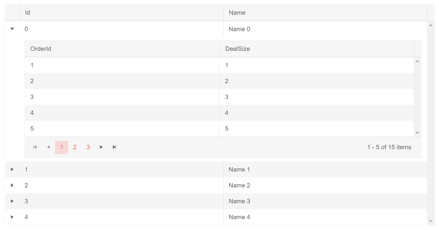
Change the built-in expand/collapse icons. The result of the code snippet above.
Notes
To get the desired icons, you can use your dev tools to inspect the rendered icon that you want to use and get its content/path. Also, you can use any custom icons that are not from the Telerik icons package (e.g., icons from Bootstrap, Open Iconic, and so on) by specifying the desired font name in addition to the content.