Increase the size of the DatePicker's popup to fit the content
Environment
| Product | DatePicker for Blazor, Calendar for Blazor |
Description
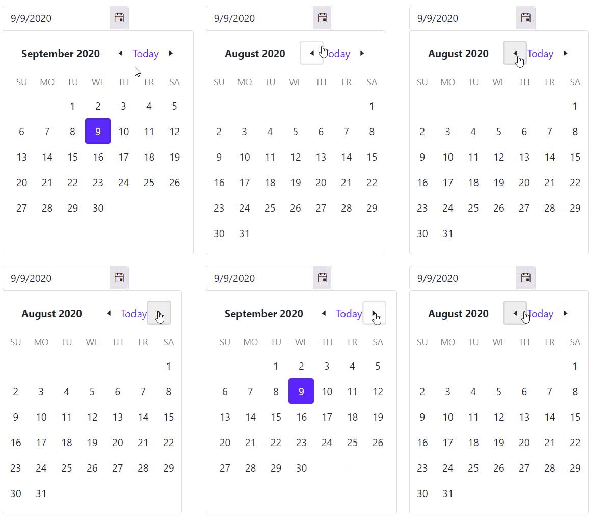
I am using the Bootstrap theme and the popup resizes when I navigate between the months. This cases the navigational arrows to be displaced so I cannot click on them repeatedly.
The popup of the DatePicker is resized based on month's name length. Problematic example.

Cause
The Bootstrap theme has a larger font size which causes long month names to take up more space than in other themes. For example, the month of September is long and pushes the layout of the popup to be wider, which, in turn, changes its width and the relative position of the next/prev arrows to the mouse.
Solutions
There are two possible solutions:
Use the PopupWidth parameter
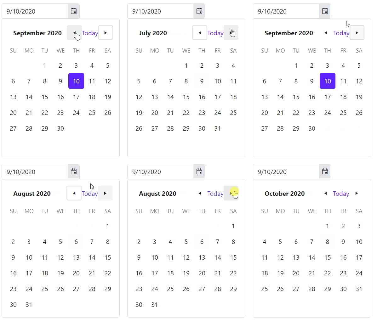
You can control the popup width for the DatePicker by using the PopupWidth parameter that the components exposes. You can set it in pixels or any other valid CSS dimensions to fit the content of the popup.
<TelerikDatePicker @bind-Value="datePickerValue" PopupWidth="300px"></TelerikDatePicker>

@code  {
    DateTime datePickerValue { get; set; } = DateTime.Now;
}
The result from the code snippet above

Use CSS to reduce the font size of the months name
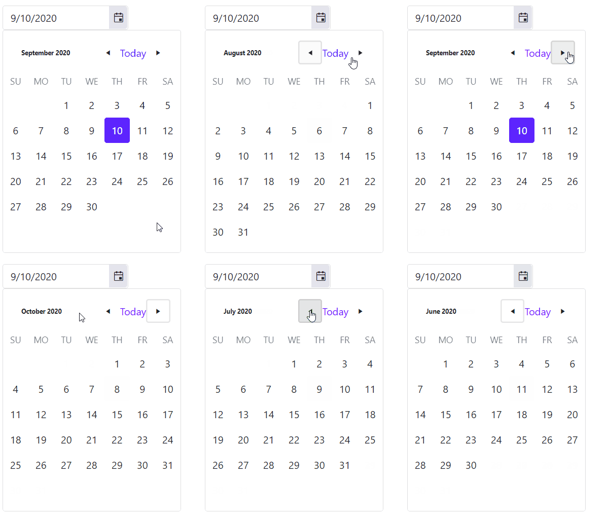
This example utilizes CSS to reduce the font-size of the month's name in the dropdown of the DatePicker. This solution might also be applied to the Telerik Calendar component for Blazor.
If you are using it for the Calendar component you can pass a custom CSS class to the
Classparameter of the Calendar and cascade the styles through that class.
<style>
    .k-calendar .k-calendar-header .k-title.k-button {
        font-size: 10px;
    }
</style>

<TelerikDatePicker @bind-Value="datePickerValue" Class="myDatePicker"></TelerikDatePicker>

@code  {
    DateTime datePickerValue { get; set; } = DateTime.Now;
}
The result from the code snippet above
