Grid and Stack layouts like in XAML
Environment
| Product | Grid for Blazor |
Description
I want to make grid and stack layouts like in XAML (WPF, Xamarin, UWP) and WinForms. In those frameworks, we use specific components for this. How do I do the same in Blazor?
Answer
Blazor is a Web framework and as such it can do everything that a standard web page can do. This includes benefiting from the browser rendering engine and modern CSS features like the CSS Grid and CSS Flexbox.
With their help, you can write a few lines of basic HTML and CSS and you may not need Blazor components at all - ultimately, the components and code you write in Blazor become HTML elements that are styled with CSS.
Familiarity with the core concepts will let you create flexible layouts with a few lines of CSS where you can plug your actual Blazor components that implement functionality. Using standard web technologies can also help you create better Blazor components.
In this article:
Basic Examples
The simple examples here place the CSS rules next to the HTML code, in a real application you would likely move them to a site-wide stylesheet and there they can be reused and will be abstracted away from the HTML they style.
Grid Layout
To do a grid layout, the easiest approach is to use a CSS Grid. For example:
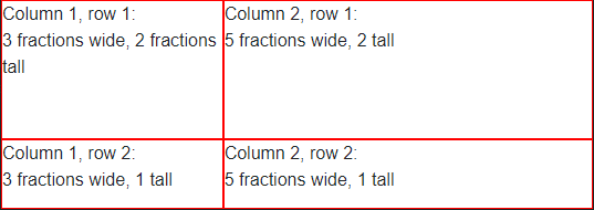
<style>
    .main-layout {
        /*display arrangement*/
        display: grid;
        /*make it as high as the borwserviewport*/
        height: 100vh;
        /*column width distribution*/
        grid-template-columns: 3fr 5fr;
        /*row height distribution*/
        grid-auto-rows: 2fr 1fr;
    }
        /*just a border to showcase where the elements are*/
        .main-layout > div {
            border: 1px solid red;
        }
</style>

<div class="main-layout">
    <div>Column 1, row 1:<br /> 3 fractions wide, 2 fractions tall</div>
    <div>Column 2, row 1:<br /> 5 fractions wide, 2 tall</div>
    <div>Column 1, row 2:<br /> 3 fractions wide, 1 tall</div>
    <div>Column 2, row 2:<br /> 5 fractions wide, 1 tall</div>
</div>
<Grid>
    <Grid.ColumnDefinitions>
        <ColumnDefinition Width="3*"/>
        <ColumnDefinition Width="5*"/>
    </Grid.ColumnDefinitions>
    <Grid.RowDefinitions>
        <RowDefinition Height="2*"/>
        <RowDefinition Height="1"/>
    </Grid.RowDefinitions>
</Grid>
Stack Layout
To create a stack layout, you can use CSS Flexbox. For example:
<style>
/*vertial - first example*/
.stack-vertical {
/*direction*/
display: flex;
flex-direction: column;
/*color, alignment*/
background-color: #34ace0;
color: white;
align-items: center;
}
/*horizontal - second examle*/
.stack-horizontal {
/*direction*/
display: flex;
flex-direction: row;
/*spacing, colors, alignment*/
gap: 20px;
background-color: #227093;
color: white;
justify-content: center;
}
</style>
@* Vertically align items on top of one another *@
<div class="stack-vertical">
<p>Today - 64° F</p>
<p>Partially Cloudy</p>
<p>Precipitation: 25%</p>
</div>
@* Horizontally align items next to one another *@
<div class="stack-horizontal">
<p>High: 66°</p>
<p>Low: 43°</p>
<p>Feels like: 63°</p>
</div>
<StackPanel Grid.Column="1" Margin="40,0,0,0" VerticalAlignment="Center">
    <TextBlock Foreground="White" FontSize="25" Text="Today - 64° F"/>
    <TextBlock Foreground="White" FontSize="25" Text="Partially Cloudy"/>
    <TextBlock Foreground="White" FontSize="25" Text="Precipitation: 25%"/>
</StackPanel>
<StackPanel Grid.Row="1" Grid.ColumnSpan="2" Orientation="Horizontal"
            HorizontalAlignment="Center" VerticalAlignment="Center">
    <TextBlock Foreground="White" FontSize="25" Text="High: 66°" Margin="0,0,20,0"/>
    <TextBlock Foreground="White" FontSize="25" Text="Low: 43°" Margin="0,0,20,0"/>
    <TextBlock Foreground="White" FontSize="25" Text="Feels like: 63°"/>
</StackPanel>
Detailed Tutorials and Examples
The following resources explain these concepts in more detail:
Blazor Layout Components - blog post by Ed Charbeneau - also features an example of mixing both the grid and stack layout approaches, and more learning resources.
-
Blazor Layout Components - Stream recording from the Blazor Power Hour show by Ed Charbeneau