Stepper Indicators
This article explains the configuration of the content that will be rendered in the step indicators. Each step could contain text or icon.
In this article:
Indicator Text
Stepper component allows you to use text for its step indicators. You can define the desired string for each step through the Text parameter the StepperStep exposes.
Stepper component with a text indicators. The result form the snippet below.
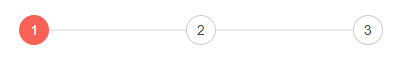
@* Stepper with text indicators *@

<div style="width:500px">
    <TelerikStepper>
        <StepperSteps>
            <StepperStep Text="1"></StepperStep>
            <StepperStep Text="2"></StepperStep>
            <StepperStep Text="3"></StepperStep>
        </StepperSteps>
    </TelerikStepper>
</div>
Indicator Icon
Stepper component allows you to use Font and SVG icons for its step indicators. You can define the desired visual content through the following parameters of the StepperStep:
-
Icon- defines the name of the desired Telerik font icon.
More details as well as a list of the available Telerik font icons you can find in the Built-in Icons article.
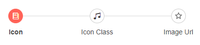
@* Stepper with icon indicators *@

<div style="width:500px">
    <TelerikStepper>
        <StepperSteps>
            <StepperStep Icon="@SvgIcon.Globe" Label="Font Icon"></StepperStep>
            <StepperStep Icon="@SvgIcon.Pin" Label="Svg Icon"></StepperStep>
        </StepperSteps>
    </TelerikStepper>
</div>
Notes
When defining text and icons for the step indicators, you should take into consideration the following specifics:
The icons have priority over the text.
If there is no icon, the text is used.
If there is no text either, the component will render the order of the step as text. If this is the first defined step, the text "1" will be displayed.