Step Template
You can customize the whole appearance of the steps through their Template. It allows you to control the rendering and styles of both indicators and labels of the step.
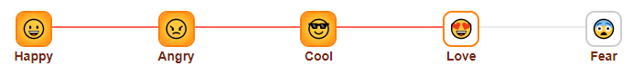
Use the Step Template to customize the appearance of the steps. The result from the snippet below.
@* Step Template *@

<TelerikStepper @bind-Value="@CurrentStepIndex">
    <StepperSteps>
        <StepperStep Template="@CreateTemplate(Happy, "Happy")" />
        <StepperStep Template="@CreateTemplate(Angry, "Angry")" />
        <StepperStep Template="@CreateTemplate(Cool, "Cool")" />
        <StepperStep Template="@CreateTemplate(Love, "Love")" />
        <StepperStep Template="@CreateTemplate(Fear, "Fear")" />
    </StepperSteps>
</TelerikStepper>

@code {

    public int CurrentStepIndex { get; set; } = 3;

    RenderFragment CreateTemplate(string emoji, string label)
    {
        return
            @<text>
                <div class="custom-step">
                    <span style="font-size:20px">@emoji</span>
                </div>
                <span class="step-label">@label</span>
            </text>;
    }

    string Happy = char.ConvertFromUtf32(0x1F600);
    string Angry = char.ConvertFromUtf32(0x1F620);
    string Cool = char.ConvertFromUtf32(0x1F60E);
    string Love = char.ConvertFromUtf32(0x1F60D);
    string Fear = char.ConvertFromUtf32(0x1F628);

}

<style>
    .custom-stepper .k-progressbar {
        height: 4px;
        top: 18px;
    }

        .custom-stepper .k-progressbar .k-selected {
            background: linear-gradient(to right, #ffc837, #ff8008);
        }

    .custom-step {
        width: 40px;
        height: 40px;
        border: 2px solid #ff8008;
        border-radius: 10px;
        background-clip: padding-box;
        border-radius: 10px;
        box-sizing: border-box;
        text-align: center;
        display: inline-flex;
        align-items: center;
        justify-content: center;
        background-color: #fff;
    }

    .k-step-done .custom-step {
        background-image: radial-gradient(circle at center, #ffC837 10px, #ff8008);
    }

    .k-step:not(.k-step-done):not(.k-step-current) .custom-step {
        border: 2px solid #ccc;
    }

    .k-step-link .k-icon {
        font-size: 24px;
        color: #000;
    }

    .k-step-link .step-label {
        color: #75240d;
        font-weight: bold;
    }
</style>