Display Modes
This article explains the Display modes that the Stepper for Blazor provides.
You can configure the desired display mode through the StepType parameter of the Stepper. It takes a member of the StepperStepType enum:
Steps
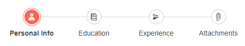
The default Display mode of the Stepper is Steps. If labels are defined, with this setup the Stepper will render both indicators and labels.
Display mode: Steps, customize the Stepper to render indicators and labels.The result from the snippet.
@* Stepper with both labels and indicators. *@

<div style="width:500px">
    <TelerikStepper StepType="StepperStepType.Steps">
        <StepperSteps>
            <StepperStep Label="Personal Info" Icon="@SvgIcon.User"></StepperStep>
            <StepperStep Label="Education" Icon="@SvgIcon.Book"></StepperStep>
            <StepperStep Label="Experience" Icon="@SvgIcon.FlipVertical"></StepperStep>
            <StepperStep Label="Attachments" Icon="@SvgIcon.Paperclip"></StepperStep>
        </StepperSteps>
    </TelerikStepper>
</div>
Labels
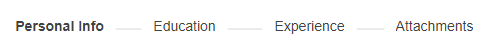
If you want to display only labels for the steps, set the StepType parameter of the Stepper to Labels.
Display mode: Labels, customize the Stepper to render only labels. The result from the snippet.
@* Stepper with only labels. *@

<div style="width:500px">
    <TelerikStepper StepType="StepperStepType.Labels">
        <StepperSteps>
            <StepperStep Label="Personal Info" Icon="@SvgIcon.User"></StepperStep>
            <StepperStep Label="Education" Icon="@SvgIcon.Book"></StepperStep>
            <StepperStep Label="Experience" Icon="@SvgIcon.FlipVertical"></StepperStep>
            <StepperStep Label="Attachments" Icon="@SvgIcon.Paperclip"></StepperStep>
        </StepperSteps>
    </TelerikStepper>
</div>