PanelBar Data Binding Basics
This article explains the different ways to provide data to a PanelBar component, the properties related to data binding and their results.
For details on Value Binding and Data Binding, and the differences between them, see the Value Binding vs Data Binding article.
First, review:
- The available (bindable) features of a PanelBar item.
- How to match fields in the model with the PanelBar item data bindings.
There are two modes of providing data to a PanelBar, and they both use the items' features. Once you are familiar with the current article, choose the data binding mode you wish to use:
- Flat data - a single collection of items with defined parent-child relationships.
- Hierarchical data - separate collections of items and their child items.
PanelBar Item Features
The PanelBar items provide the following features that you control through the corresponding fields in their data binding:
Id-string- a unique identifier for the item. Required for binding to flat data.ParentId-string- identifies the parent to whom the item belongs. Required only when binding to flat data. All items with the sameParentIdwill be rendered at the same level. For a root level item, this must benull.HasChildren-string- whether the item has children. Determines whether an expand arrow is rendered next to the item. Required for binding to flat data. With hierarchical data, the PanelBar will render the icon based on the existence of child items, butHasChildrenwill take precedence.Items-string- the collection of child items that will be rendered under the current item. Required only when binding to hierarchical data.Text-string- the text that will be shown on the item.DisabledField-string- whether the item is disabled. If an item is disabled it will not be clickable and cannot be expanded by the user. TheOnItemClickwill not be fired if the item is disabled.Icon- The Telerik Font or SVG icon that will be rendered in the item. Read more in the Icons article.Url- the view the item will navigate to by generating a link.
Data Bindings
The properties of a panelbar item match directly to a field of the model the component is bound to. You provide that relationship by providing the name of the field from which the corresponding information is present. To do this, under the PanelBarBindings tag, use the PanelBarBinding tag properties.
Each PanelBarBinding tag exposes the following properties that refer to item properties:
IdField => Id
ParentIdField => ParentId
TextField => Text
DisabledField => Disabled
IconField => Icon
UrlField => Url
HasChildrenField => HasChildren
ItemsField => Items
Level - this is used for defining different bindings for different levels. If no level is set, the bindings are taken as default for any level that does not have explicit settings. You should have one
TelerikPanelBarBindingwithout a level.
There are default values for the field names. If your model names match the defaults, you don't have to define them in the bindings settings.
If your model field names match any of the default names, the component will try to use them. For example, a field called Icon will try to produce a Telerik icon out of those values and that may not be what you want. If you want to override such behaviors, you can set IconField="someNonExistingField". You can read more about this here. This also applies to other fields too. Another example would be a field called Url - in case you want to perform navigation yourself through templates, you may want to set UrlField="someFakeField" so that the component does not navigate on its own.
If you are using hierarchical data binding, your model must not contain a field called
ParentId(or a field that matches the name given to theParentIdFieldparameter of aPanelBarBinding). That would confuse the PanelBar that it is binding to flat data, and so there may be no roots and you may see no data.
Default field names for PanelBar item bindings. If you use these, you don't have to specify them in the PanelBarBinding tag explicitly.
public class PanelBarItem
{
    public int Id { get; set; }
    public string Text { get; set; }
    public int? ParentId { get; set; }
    public bool Disabled { get; set; }
    public bool HasChildren { get; set; }
    public ISvgIcon Icon { get; set; }
    public string Url { get; set; }
}
The following Example shows how to define simple binding to match item fields to a model so a tree renders the provided flat data source.
Sample binding on a flat data source. Showcases how to set the properties to match the model. With this model, the only field name you must explicitly specify is ParentIdField, the others match the defaults.
<div style="width: 30%;">
    <TelerikPanelBar Data="@Items"
                     @bind-ExpandedItems="@ExpandedItems">
    </TelerikPanelBar>
</div>

@code {
    public List<PanelBarItem> Items { get; set; }
    public IEnumerable<object> ExpandedItems { get; set; } = new List<object>();

    public class PanelBarItem
    {
        public int Id { get; set; }
        public string Text { get; set; }
        public int? ParentId { get; set; }
        public bool HasChildren { get; set; }
        public ISvgIcon Icon { get; set; }
        public string Url { get; set; }
    }

    private List<PanelBarItem> LoadFlatData()
    {
        List<PanelBarItem> items = new List<PanelBarItem>();

        items.Add(new PanelBarItem()
            {
                Id = 1,
                Text = "Project",
                ParentId = null,
                HasChildren = false,
                Icon = SvgIcon.Folder,
                Url = "projectURL.url"
            });

        items.Add(new PanelBarItem()
            {
                Id = 2,
                Text = "Implementation",
                ParentId = null,
                HasChildren = true,
                Icon = SvgIcon.Code
            });

        items.Add(new PanelBarItem()
            {
                Id = 3,
                Text = "C#",
                ParentId = 2,
                HasChildren = false,
                Icon = SvgIcon.Cs
            });

        items.Add(new PanelBarItem()
            {
                Id = 4,
                Text = "HTML 5",
                ParentId = 2,
                HasChildren = false,
                Icon = SvgIcon.Html5
            });

        items.Add(new PanelBarItem()
            {
                Id = 5,
                Text = "CSS",
                ParentId = 2,
                HasChildren = false,
                Icon = SvgIcon.Css
            });

        return items;
    }

    protected override void OnInitialized()
    {
        Items = LoadFlatData();

        ExpandedItems = new List<object>() { Items[1] };

        base.OnInitialized();
    }
}
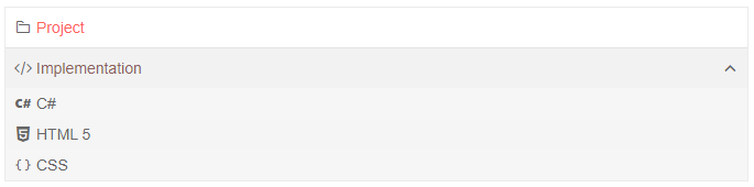
The result from the snippet above
Multiple Level Bindings
You can define different binding settings for the different levels of nodes in the PanelBar. With this, the children of a node can consume a different field than their parent, and this may make your application more flexible. If you use hierarchical data binding, the children can even use a different field or model from their parent.
This also allows you to define different header and content templates for different levels.
To define multiple bindings, add multiple PanelBarBinding tags and define their Level.
There can be maximum one binding for each level and one ("default") binding without a level. If multiple same-level bindings are declared, the first one is used and the rest are ignored.
If a certain level does not have an explicit data binding tag, it will use the default one that has no level.
How to use per-level data binding settings to change model fields
@* Provide data to different levels of the PanelBar *@

<div style="width: 30%;">
    <TelerikPanelBar Data="@Items"
                     @bind-ExpandedItems="@ExpandedItems">
        <PanelBarBindings>
            <PanelBarBinding Level="1" TextField="SecondLevelText">
                <HeaderTemplate>
                    @{
                        var item = context as PanelBarItem;

                        <div style="font-weight: bold; text-decoration: underline">
                            @item.SecondLevelText
                        </div>
                    }
                </HeaderTemplate>
            </PanelBarBinding>
        </PanelBarBindings>
    </TelerikPanelBar>
</div>

@code {
    public List<PanelBarItem> Items { get; set; }
    public IEnumerable<object> ExpandedItems { get; set; } = new List<object>();

    public class PanelBarItem
    {
        public int Id { get; set; }
        public string Text { get; set; }
        public string SecondLevelText { get; set; }
        public int? ParentId { get; set; }
        public bool HasChildren { get; set; }
        public ISvgIcon Icon { get; set; }
        public string Url { get; set; }
    }

    private List<PanelBarItem> LoadFlatData()
    {
        List<PanelBarItem> items = new List<PanelBarItem>();

        items.Add(new PanelBarItem()
            {
                Id = 1,
                Text = "Project",
                ParentId = null,
                HasChildren = false,
                Icon = SvgIcon.Folder,
                Url = "projectURL.url"
            });

        items.Add(new PanelBarItem()
            {
                Id = 2,
                Text = "Implementation",
                ParentId = null,
                HasChildren = true,
                Icon = SvgIcon.Code
            });

        items.Add(new PanelBarItem()
            {
                Id = 3,
                SecondLevelText = "C#",
                ParentId = 2,
                HasChildren = false,
                Icon = SvgIcon.Cs
            });

        items.Add(new PanelBarItem()
            {
                Id = 4,
                SecondLevelText = "HTML 5",
                ParentId = 2,
                HasChildren = false,
                Icon = SvgIcon.Html5
            });

        items.Add(new PanelBarItem()
            {
                Id = 5,
                SecondLevelText = "CSS",
                ParentId = 2,
                HasChildren = false,
                Icon = SvgIcon.Css
            });

        return items;
    }

    protected override void OnInitialized()
    {
        Items = LoadFlatData();

        ExpandedItems = new List<object>() { Items[1] };

        base.OnInitialized();
    }
}
To improve performance when using flat data binding, all the bindings for all the levels should use the same
ParentIdField.