Appearance Settings
The Notification component provides parameters and properties that allows you to customize its appearance. For brevity, this article will be divided in the following sections:
You can use all three together to get the desired appearance. This article will explain their effect one by one.
AnimationType
The AnimationType parameter controls the way the Notification will appear on the screen. It takes a member of the Telerik.Blazor.AnimationType enum:
-
Fade- the default animation NonePushUpPushDownPushLeftPushRightRevealVerticalSlideInSlideDownSlideLeftSlideRightZoomInZoomOut
You can see them in action in the Notification Animation Live Demo.
Set an animation for the Notification component
@* This sample uses the ZoomOut animation, you can change it *@
<TelerikButton OnClick="@AddNotification">Add a basic notification</TelerikButton>
<TelerikNotification @ref="@NotificationReference" AnimationType="@AnimationType.ZoomOut"></TelerikNotification>
@code {
public TelerikNotification NotificationReference { get; set; }
public void AddNotification()
{
NotificationReference.Show(new NotificationModel()
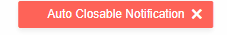
{
Text = "Auto Closable Notification",
ThemeColor = "primary"
});
}
}
Size
You can control the Size of the Notification by using CSS. To make the cascading of the styles easier and target a single instance of the component you should use the Class parameter exposed in the the <TelerikNotification> tag.
Chance the Notiication width and height
<TelerikNotification @ref="@NotificationRef1"
                     Class="large-notification-center">
</TelerikNotification>

<TelerikNotification @ref="@NotificationRef2"
                     Class="large-notification-top">
</TelerikNotification>

Show a Notification and the content will be ...

<TelerikButton OnClick="@( () => ShowNotification(NotificationRef1, "Vertically centered text") )">
    Vertically Centered
</TelerikButton>

<TelerikButton OnClick="@( () => ShowNotification(NotificationRef2, "Text at the top") )">
    At the Top
</TelerikButton>

<style>
    /* for centered content */
    .large-notification-center .k-notification,
    /* for top content */
    .large-notification-top .k-notification-content {
        width: 300px;
        height: 200px;
    }

    /* move close button up */
    .large-notification-top .k-notification-actions,
    /* move success icon up - for some ThemeColors only */
    .large-notification-top .k-notification > .k-icon {
        align-self: start;
    }
</style>

@code {
    private TelerikNotification NotificationRef1 { get; set; }

    private TelerikNotification NotificationRef2 { get; set; }

    private void ShowNotification(TelerikNotification notifRef, string text)
    {
        notifRef.Show(new NotificationModel()
        {
            Text = text,
            ThemeColor = ThemeConstants.Notification.ThemeColor.Success,
            Closable = true,
            CloseAfter = 0
        });
    }
}
ThemeColor
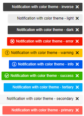
The color of the notification popup is easily controlled through the ThemeColor parameter. You can set it to a member of the Telerik.Blazor.ThemeColor class:
PrimarySecondaryTertiarySuccessInfoWarningErrorDarkLightInverse
These predefined options match the main Telerik Theme and you can see that in action in the Notification Appearance Live Demo.
There are built-in themes for the most common notifications such as Success, Info, Warning, Error, that also come with predefined icons, so you don't have to set them explicitly.
Built-in Theme Colors
@* This sample adds a notification with each built-in theme color *@

<TelerikButton OnClick="@AddColoredNotifications">Add colored notifications</TelerikButton>

<TelerikNotification @ref="@NotificationReference" AnimationType="@AnimationType.ZoomOut"></TelerikNotification>

@code {
    public TelerikNotification NotificationReference { get; set; }

    public void AddColoredNotifications()
    {
        var fields = typeof(Telerik.Blazor.ThemeColors)
                .GetFields(System.Reflection.BindingFlags.Public | System.Reflection.BindingFlags.Static |
                   System.Reflection.BindingFlags.FlattenHierarchy)
                .Where(fi => fi.IsLiteral && !fi.IsInitOnly).ToList();

        for (int i = 0; i < fields.Count; i++)
        {
            var currentField = fields[i];
            var color = currentField.GetValue(null).ToString();

            NotificationReference.Show(new NotificationModel()
            {
                Text = $"Notification with color theme - {color}",
                ThemeColor = $"{color}"
            });
        }
    }
}
The ThemeColor parameter renders as the k-notification-<ThemeColor> CSS class on the specific notification HTML element and you can set it to a custom value to cascade through, and set the color to a setting of your own without customizing the entire theme.
Custom Notification color without customizing the Telerik Theme
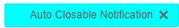
@* Sample of using a custom notification theme color from your own styles *@

<style>
    .k-notification-custom-color {
        background-color: cyan;
    }
</style>

<TelerikButton OnClick="@AddNotification">Add a notification</TelerikButton>

<TelerikNotification @ref="@NotificationReference"></TelerikNotification>

@code {
    public TelerikNotification NotificationReference { get; set; }

    public void AddNotification()
    {
        NotificationReference.Show(new NotificationModel()
        {
            Text = "Auto Closable Notification",
            ThemeColor = "custom-color"
        });
    }
}
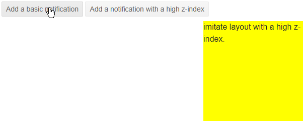
Z-Index
By default, the notification does not have a z-index and it shows above most elements because it has position: fixed in its CSS rules.
In some layouts you may have elements with a certain z-index and they will hide the notification.
You can use the Class of the notification to set a higher z-index for the notification according to your layout so it can show according to the desired stacking order - above some elements, perhaps behind others.
Set z-index to the notification so it is not shown behind other elements
@* Add a z-index to a notification so you can show them above layout elements with high z-index *@

<style>
    .high-zindex {
        z-index: 654321;
    }
</style>

<TelerikButton OnClick="@AddBasicNotification">Add a basic notification</TelerikButton>
<TelerikButton OnClick="@AddZIndexNotification">Add a notification with a high z-index</TelerikButton>

<TelerikNotification Class="high-zindex" @ref="@HighZIndexNotification"></TelerikNotification>

<TelerikNotification @ref="@BasicNotification"></TelerikNotification>

<div style="z-index: 1234; position: fixed; right: 0; bottom: 0; width: 200px; height: 200px; background: yellow">
    imitate layout with a high z-index.
</div>

@code {
    TelerikNotification HighZIndexNotification { get; set; }
    TelerikNotification BasicNotification { get; set; }

    void AddZIndexNotification()
    {
        HighZIndexNotification.Show(new NotificationModel()
        {
            Text = "High z-index shows it above other layout elements",
            ThemeColor = "success",
            CloseAfter = 0
        });
    }

    void AddBasicNotification()
    {
        BasicNotification.Show(new NotificationModel()
        {
            Text = "Default behavior - will be hidden behind the \"layout\" element.",
            ThemeColor = "dark",
            CloseAfter = 0
        });
    }
}
ThemeBuilder
To take full control over the appearance of the Telerik UI for Blazor components, you can create your own styles by using ThemeBuilder.
ThemeBuilder is a web application that enables you to create new themes and customize existing ones. Every change that you make is visualized almost instantly. Once you are done styling the UI components, you can export a ZIP file with the styles for your theme and use them in your Blazor app.