Donut Chart
The Blazor Donut chart displays the data as sectors from a two-dimensional circle and is therefore useful for displaying data as parts of a whole. Unlike a pie chart, it can have multiple series in the same chart. There is a hole in the middle of the circle, hence the name of the chart.
This article assumes you are familiar with the chart basics and data binding.
Creating Donut Chart
- Add a
ChartSeriesto theChartSeriesItemscollection - Set its
Typeproperty toChartSeriesType.Donut - Provide a data model collection to its
Dataproperty - Set the
FieldandCategoryFieldproperties to the corresponding fields in the model that carry the values and names that will be shown in the legend
If you use simple data binding and only provide values, the chart will not render a legend.
A donut chart that shows product revenues
Donut series

<TelerikChart>
    <ChartSeriesItems>
        <ChartSeries Type="ChartSeriesType.Donut" Data="@donutData"
                            Field="@nameof(MyDonutChartModel.SegmentValue)" CategoryField="@nameof(MyDonutChartModel.SegmentName)">
        </ChartSeries>
    </ChartSeriesItems>

    <ChartTitle Text="Revenue per product"></ChartTitle>

    <ChartLegend Position="ChartLegendPosition.Right">
    </ChartLegend>
</TelerikChart>

@code {
    public class MyDonutChartModel
    {
        public string SegmentName { get; set; }
        public double SegmentValue { get; set; }
        public bool ShouldShowInLegend { get; set; } = true;
    }

    public List<MyDonutChartModel> donutData = new List<MyDonutChartModel>
    {
        new MyDonutChartModel
        {
            SegmentName = "Product 1",
            SegmentValue = 2
        },
        new MyDonutChartModel
        {
            SegmentName = "Product 2",
            SegmentValue = 3
        },
        new MyDonutChartModel
        {
            SegmentName = "Product 3",
            SegmentValue = 4
        }
    };
}
Donut Chart Specific Appearance Settings
The following sections explain specific configuration options to the donut charts:
- Rotation
- Color Field
- Exploded Segment
- Visible In Legend
- Hole Size
- Multiple Series
- Customize Chart Elements - Nested Tags Settings
Rotation
By default, the first segment starts at the top. You can change that by using the StartAngle property of the series.
Color Field
You can control the color of the individual segments of the donut chart by providing a string with the desired color in the model, and setting the ColorField of the series to it. You can pass a valid CSS color (for example, #abcdef, #f00, or blue).
@*Set color to the donut chart items*@

<TelerikChart>
    <ChartSeriesItems>
        <ChartSeries Type="ChartSeriesType.Donut"
                     Data="@donutData"

                     ColorField="@nameof(MyDonutChartModel.SegmentColor)"

                     Field="@nameof(MyDonutChartModel.SegmentValue)"
                     CategoryField="@nameof(MyDonutChartModel.SegmentName)">
        </ChartSeries>
    </ChartSeriesItems>

    <ChartTitle Text="Revenue per product"></ChartTitle>

    <ChartLegend Position="ChartLegendPosition.Right">
    </ChartLegend>
</TelerikChart>

@code {
    public class MyDonutChartModel
    {
        public string SegmentName { get; set; }
        public double SegmentValue { get; set; }
        public string SegmentColor { get; set; }
    }

    public List<MyDonutChartModel> donutData = new List<MyDonutChartModel>
    {
        new MyDonutChartModel
        {
            SegmentName = "Product 1",
            SegmentValue = 2,
            SegmentColor = "red"
        },
        new MyDonutChartModel
        {
            SegmentName = "Product 2",
            SegmentValue = 3,
            SegmentColor = "#00ff00"
        },
        new MyDonutChartModel
        {
            SegmentName = "Product 3",
            SegmentValue = 4,
            SegmentColor = "#00f"
        }
    };
}
Exploded Segment
You can have some of the segments of the donut chart separated from the rest of the circle with a small margin. This helps bring attention to them as outliers or as important bits that the viewer should focus on.
To explode (separate) a segment, use the ExplodeField property of the series and set it to a boolean field that indicates whether the segment is exploded. Only a true value explodes a segment, so you can use a nullable field as well and only provide values for the items you want separated.
Exploded Items
@*Separate items from the main body of the chart*@

<TelerikChart>
    <ChartSeriesItems>
        <ChartSeries Type="ChartSeriesType.Donut"
                     Data="@donutData"

                     ExplodeField="@nameof(MyDonutChartModel.IsSeparated)"

                     Field="@nameof(MyDonutChartModel.SegmentValue)"
                     CategoryField="@nameof(MyDonutChartModel.SegmentValue)">
        </ChartSeries>
    </ChartSeriesItems>

    <ChartTitle Text="Revenue per product"></ChartTitle>

    <ChartLegend Position="ChartLegendPosition.Right">
    </ChartLegend>
</TelerikChart>

@code {
    public class MyDonutChartModel
    {
        public string SegmentName { get; set; }
        public double SegmentValue { get; set; }
        public bool? IsSeparated { get; set; }
    }

    public List<MyDonutChartModel> donutData = new List<MyDonutChartModel>
    {
        new MyDonutChartModel
        {
            SegmentName = "Product 1",
            SegmentValue = 2,
            IsSeparated = true
        },
        new MyDonutChartModel
        {
            SegmentName = "Product 2",
            SegmentValue = 3
        },
        new MyDonutChartModel
        {
            SegmentName = "Product 3",
            SegmentValue = 4
        }
    };
}
Visible In Legend
You can hide certain segments from the legend (for example, if their contribution is insignificantly small). To do this, add a boolean field to the model and set its name to the VisibleInLegendField property of the donut series. The flags in this field will denote whether the particular item will be rendered in the legend.
Hide segments from the legend
@*Show only some items in the legend*@

<TelerikChart>
    <ChartSeriesItems>
        <ChartSeries Type="ChartSeriesType.Donut"
                     Data="@donutData"

                     VisibleInLegendField="@nameof(MyDonutChartModel.ShouldShowInLegend)"

                     Field="@nameof(MyDonutChartModel.SegmentValue)"
                     CategoryField="@nameof(MyDonutChartModel.SegmentName)">
        </ChartSeries>
    </ChartSeriesItems>

    <ChartTitle Text="Revenue per product"></ChartTitle>

    <ChartLegend Position="ChartLegendPosition.Right">
    </ChartLegend>
</TelerikChart>

@code {
    public class MyDonutChartModel
    {
        public string SegmentName { get; set; }
        public double SegmentValue { get; set; }
        public bool ShouldShowInLegend { get; set; } = true;
    }

    public List<MyDonutChartModel> donutData = new List<MyDonutChartModel>
    {
        new MyDonutChartModel
        {
            SegmentName = "Product 1",
            SegmentValue = 2
        },
        new MyDonutChartModel
        {
            SegmentName = "Product 2",
            SegmentValue = 3
        },
        new MyDonutChartModel
        {
            SegmentName = "Product 3",
            SegmentValue = 4
        },
        new MyDonutChartModel
        {
            SegmentName = "Insignificant Product",
            SegmentValue = 0.1,
            ShouldShowInLegend = false
        }
    };
}
Hole Size
You can change the percentage that the hole in the middle takes from the entire diameter of the circle by setting the HoleSize property of the series. Setting 0 removes the hole, and 100 means the entire chart is the hole.
Control the hole size of the donut chart

<TelerikChart>
    <ChartSeriesItems>
        <ChartSeries Type="ChartSeriesType.Donut" Data="@donutData" HoleSize="90"
                            Field="@nameof(MyDonutChartModel.SegmentValue)" CategoryField="@nameof(MyDonutChartModel.SegmentName)">
        </ChartSeries>
    </ChartSeriesItems>

    <ChartTitle Text="Revenue per product"></ChartTitle>

    <ChartLegend Position="ChartLegendPosition.Right">
    </ChartLegend>
</TelerikChart>

@code {
    public class MyDonutChartModel
    {
        public string SegmentName { get; set; }
        public double SegmentValue { get; set; }
        public bool ShouldShowInLegend { get; set; } = true;
    }

    public List<MyDonutChartModel> donutData = new List<MyDonutChartModel>
    {
        new MyDonutChartModel
        {
            SegmentName = "Product 1",
            SegmentValue = 2
        },
        new MyDonutChartModel
        {
            SegmentName = "Product 2",
            SegmentValue = 3
        },
        new MyDonutChartModel
        {
            SegmentName = "Product 3",
            SegmentValue = 4
        }
    };
}
Multiple Series
Unlike a pie chart, a donut chart can have multiple series in a single chart. Each series is nested in the next - the first declared series is in the center, and the last series is at the outer edge.
You can use multiple series to showcase relationships within a data set, or several similar sets of data.
You can also use the ColorField property to define a field with the segments' colors. With this, you can color-code different series and their relationships to one another.
@* You can bind the entire chart to one collection of data, even though this example shows separate collections for each series *@

<TelerikChart>
    <ChartSeriesItems>
        <ChartSeries Type="ChartSeriesType.Donut" Data="@firstSeriesData"
                     Field="@nameof(MyDonutChartModel.SegmentValue)" CategoryField="@nameof(MyDonutChartModel.SegmentName)">
        </ChartSeries>
        <ChartSeries Type="ChartSeriesType.Donut" Data="@secondSeriesData"
                     Field="@nameof(MyDonutChartModel.SegmentValue)" CategoryField="@nameof(MyDonutChartModel.SegmentName)">
        </ChartSeries>
        <ChartSeries Type="ChartSeriesType.Donut" Data="@thirdSeriesData"
                     Field="@nameof(MyDonutChartModel.SegmentValue)" CategoryField="@nameof(MyDonutChartModel.SegmentName)">
        </ChartSeries>
        <ChartSeries Type="ChartSeriesType.Donut" Data="@fourthSeriesData"
                     Field="@nameof(MyDonutChartModel.SegmentValue)" CategoryField="@nameof(MyDonutChartModel.SegmentName)">
        </ChartSeries>
    </ChartSeriesItems>

    <ChartTitle Text="Revenue per product"></ChartTitle>

    <ChartLegend Position="ChartLegendPosition.Right">
    </ChartLegend>
</TelerikChart>

@code {
    public class MyDonutChartModel
    {
        public string SegmentName { get; set; }
        public double SegmentValue { get; set; }
        public bool ShouldShowInLegend { get; set; } = true;
    }

    public List<MyDonutChartModel> firstSeriesData = new List<MyDonutChartModel>
    {
        new MyDonutChartModel
        {
            SegmentName = "Product Line 1",
            SegmentValue = 2
        },
        new MyDonutChartModel
        {
            SegmentName = "Product Line 2",
            SegmentValue = 3
        },
        new MyDonutChartModel
        {
            SegmentName = "Product Line 3",
            SegmentValue = 4
        }
    };

    public List<MyDonutChartModel> secondSeriesData = new List<MyDonutChartModel>
    {
        new MyDonutChartModel
        {
            SegmentName = "Product Line 1 - Product 1",
            SegmentValue = 4
        },
        new MyDonutChartModel
        {
            SegmentName = "Product Line 1 - Product 2",
            SegmentValue = 7
        }
    };

    public List<MyDonutChartModel> thirdSeriesData = new List<MyDonutChartModel>
    {
        new MyDonutChartModel
        {
            SegmentName = "Product Line 2 - Product 1",
            SegmentValue = 1
        },
        new MyDonutChartModel
        {
            SegmentName = "Product Line 2 - Product 2",
            SegmentValue = 5
        },
        new MyDonutChartModel
        {
            SegmentName = "Product Line 2 - Product 3",
            SegmentValue = 2
        }
    };

    public List<MyDonutChartModel> fourthSeriesData = new List<MyDonutChartModel>
    {
        new MyDonutChartModel
        {
            SegmentName = "Product Line 3 - Product 1",
            SegmentValue = 6
        },
        new MyDonutChartModel
        {
            SegmentName = "Product Line 3 - Product 2",
            SegmentValue = 11
        },
        new MyDonutChartModel
        {
            SegmentName = "Product Line 3 - Product 3",
            SegmentValue = 2
        },
        new MyDonutChartModel
        {
            SegmentName = "Product Line 3 - Product 4",
            SegmentValue = 20
        }
    };
}
Customize Chart Elements - Nested Tags Settings
When configuring nested properties and child elements in your chart, the inner tags will contain their parent tag name and add specifics to its end. In general the structure of such nested tags will be <Chart*Category**Specifics*> where the Category can be one of the following:
- CategoryAxis
- ChartArea
- Legend
- PlotArea
- SeriesItems
- Title
- Tooltip
- ValueAxis
- XAxes
- YAxes
- and others
To customize the chart, look for nested tags and their properties - the inner tags will contain their parent tag name and add specifics to its end. For example, the
ChartSeriestag has aChartSeriesLabelstag that exposes configuration options and more child tags.
For example, for axis-free charts you can rotate their Labels, Title, Legend and others. Example for doing so is customizing the Chart Series Labels by using the parameters in the
ChartSeriesItems > ChartSeries > ChartSeriesLabels tag and its child tags.
This approach is not limited only to the Labels - it can be used with to all tags that are applicable for the chart type, for example the Chart Title ChartTitle > ChartTitleMargin.
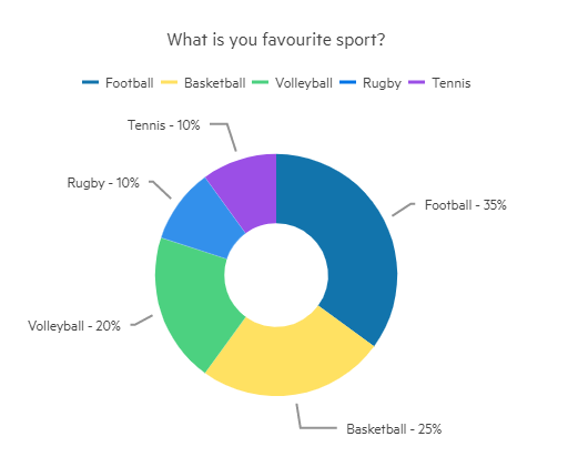
Customize Chart Title Margin, Series Label Font, and Borders
@* Add margin to the Title, changing the Font and Borders of the labels. *@

<TelerikChart>
    <ChartTitle Text="What is you favourite sport?">
        <ChartTitleMargin Bottom="20"></ChartTitleMargin>
    </ChartTitle>
    <ChartLegend Visible="true" Position="ChartLegendPosition.Top"></ChartLegend>

    <ChartSeriesItems>
        <ChartSeries Type="ChartSeriesType.Donut"
                     Data="@Data"
                     Field="@nameof(ModelData.Value)"
                     CategoryField="@nameof(ModelData.Category)">
            <ChartSeriesLabels Position="ChartSeriesLabelsPosition.OutsideEnd"
                               Visible="true"
                               Background="transparent"
                               Font="20px 'Helvetica'">
                <ChartSeriesLabelsBorder Width="1"
                                               Color="#0000FF"
                                               DashType="DashType.LongDashDotDot">
                </ChartSeriesLabelsBorder>
            </ChartSeriesLabels>
        </ChartSeries>
    </ChartSeriesItems>

</TelerikChart>

@code {
    public class ModelData
    {
        public string Category { get; set; }
        public Int32 Value { get; set; }
    }

    public List<ModelData> Data = new List<ModelData>()
    {
        new ModelData()
        {
            Category = "Football",
            Value = 35
        },
        new ModelData()
        {
            Category = "Basketball",
            Value = 25
        },
        new ModelData()
        {
            Category = "Volleyball",
            Value = 20
        },
        new ModelData()
        {
            Category = "Rugby",
            Value = 10
        },
        new ModelData()
        {
            Category = "Tennis",
            Value = 10
        },

    };
}