Card Orientation
You can define the Card orientation by setting its Orientation parameter to a member of the Telerik.Blazor.CardOrientation enum that provides the following options:
Vertical- the default
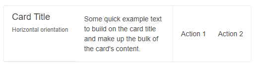
Card with Horizontal orientation
A Card with horizontal orientation. The result from the snippet below.
@* Change the orientation of the Card *@

<TelerikCard Orientation="CardOrientation.Horizontal" Width="500px">
    <CardHeader>
        <CardTitle>Card Title</CardTitle>
        <CardSubTitle>Horizontal orientation</CardSubTitle>
    </CardHeader>
    <CardBody>
        <p>Some quick example text to build on the card title and make up the bulk of the card content.</p>
    </CardBody>
    <CardSeparator></CardSeparator>
    <CardActions>
        <TelerikButton Class="k-flat">Action 1</TelerikButton>
        <TelerikButton Class="k-flat">Action 2</TelerikButton>
    </CardActions>
</TelerikCard>
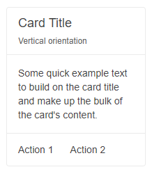
Card with Vertical orientation
Vertical orientation is the default orientation of the Card, so you don't need to explicitly define it. The below snippet demonstrates how to specify it for example purposes.
The result from the snippet below.
@* Change the orientation of the Card *@

<TelerikCard Orientation="CardOrientation.Vertical" Width="200px">
    <CardHeader>
        <CardTitle>Card Title</CardTitle>
        <CardSubTitle>Vertical orientation</CardSubTitle>
    </CardHeader>
    <CardBody>
        <p>Some quick example text to build on the card title and make up the bulk of the card content.</p>
    </CardBody>
    <CardSeparator></CardSeparator>
    <CardActions>
        <TelerikButton Class="k-flat">Action 1</TelerikButton>
        <TelerikButton Class="k-flat">Action 2</TelerikButton>
    </CardActions>
</TelerikCard>