Getting Started with the ToolBar
This tutorial explains how to set up a basic Telerik UI for ASP.NET MVC ToolBar and highlights the major steps in the configuration of the component.
You will initialize a ToolBar control with a number of tools, including a custom dropdown tool. Next, you will handle some of the ToolBar events.
Prerequisites
To successfully complete the tutorial, you need a project that is already configured to use the Telerik UI for ASP.NET MVC components:
To create a new pre-configured project for the Telerik UI for ASP.NET MVC components, you can use a project template.
To manually configure an existing project by using NuGet, see the Adding Telerik UI through NuGet.
1. Prepare the CSHTML File
The first step is to add the required directives at the top of the .cshtml document:
-
To use the Telerik UI for ASP.NET MVC HtmlHelpers:
@using Kendo.Mvc.UI
Optionally, you can structure the document by adding the desired HTML elements like headings, divs, paragraphs, and apply some basic styles.
2. Initialize the ToolBar
Use the ToolBar HtmlHelper to add the component to a page:
The
Name()configuration method is mandatory as its value is used for theidand thenameattributes of the ToolBar element.The
Items()configuration method lets you add the desired ToolBar tools.The
Resizable()option, which is enabled by default, is responsible for detecting changes in the viewport width. If the viewport is too narrow to fit all the tools in the ToolBar, the overflowing tools are hidden in a command overflow popup.The
NavigateOnTab()method enables navigation through the ToolBar items by pressing theTabkey.
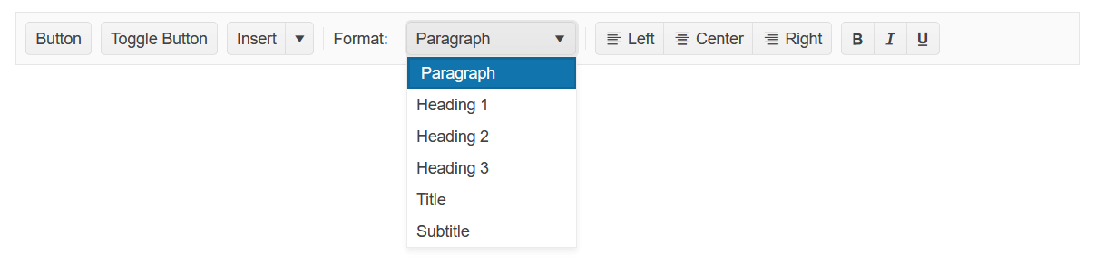
For the custom Format dropdown tool, use a template item. Add an input element in the template and initialize a Kendo UI for jQuery DropDownList from the input element in a document.ready handler.
    @using Kendo.Mvc.UI

    @(Html.Kendo().ToolBar()
        .Name("ToolBar")
        .Resizable(true)
        .NavigateOnTab(true)
        .Items(items => {
            items.Add().Type(CommandType.Button).Text("Button");
            items.Add().Type(CommandType.Button).Text("Toggle Button").Togglable(true);
            items.Add().Type(CommandType.SplitButton).Text("Insert").MenuButtons(menuButtons =>
            {
                menuButtons.Add().Text("Insert above").Icon("insert-top");
                menuButtons.Add().Text("Insert between").Icon("insert-middle");
                menuButtons.Add().Text("Insert below").Icon("insert-bottom");
            });
            items.Add().Type(CommandType.Separator);
            items.Add().Template("<label>Format:</label>");
            items.Add().Template("<input id='dropdown' style='width: 150px;' />").Overflow(ShowInOverflowPopup.Never);
            items.Add().Type(CommandType.Separator);
            items.Add().Type(CommandType.ButtonGroup).Buttons(buttons =>
            {
                buttons.Add().Text("Left").Togglable(true).Group("text-align").Icon("align-left");
                buttons.Add().Text("Center").Togglable(true).Group("text-align").Icon("align-center");
                buttons.Add().Text("Right").Togglable(true).Group("text-align").Icon("align-right");
            });
            items.Add().Type(CommandType.ButtonGroup).Buttons(buttons =>
            {
                buttons.Add().Text("Bold").Togglable(true).Icon("bold").ShowText(ShowIn.Overflow);
                buttons.Add().Text("Italic").Togglable(true).Icon("italic").ShowText(ShowIn.Overflow);
                buttons.Add().Text("Underline").Togglable(true).Icon("underline").ShowText(ShowIn.Overflow);
            });
        })
    )

    <script>
        $(document).ready( function () {
            $("#dropdown").kendoDropDownList({
                optionLabel: "Paragraph",
                dataTextField: "text",
                dataValueField: "value",
                dataSource: [
                    { text: "Heading 1", value: 1 },
                    { text: "Heading 2", value: 2 },
                    { text: "Heading 3", value: 3 },
                    { text: "Title", value: 4 },
                    { text: "Subtitle", value: 5 },
                ]
            });
        });
    </script>
4. Handle the ToolBar Events
The ToolBar exposes various events that you can handle and further customize the functionality of the component. In this tutorial, you will use the Click and Toggle events of the ToolBar, and the events of the individual tools.
    @using Kendo.Mvc.UI

    @(Html.Kendo().ToolBar()
        .Name("ToolBar")
        .Items(items =>
        {
            items.Add().Type(CommandType.Button).Text("Button 1").Id("button1").Click("buttonClickHandler");
            items.Add().Type(CommandType.Button).Text("Button 2").Id("button2").Click("buttonClickHandler");
            items.Add().Type(CommandType.Separator);
            items.Add().Type(CommandType.Button).Togglable(true).Text("Toggle 1").Id("toggle1").Toggle("buttonToggleHandler");
            items.Add().Type(CommandType.Button).Togglable(true).Text("Toggle 2").Id("toggle2").Toggle("buttonToggleHandler");
            items.Add().Type(CommandType.Separator);
            items.Add().Type(CommandType.SplitButton).Text("Split Button").Id("mainButton").Click("splitButtonClickHandler").MenuButtons(menuButtons =>
            {
                menuButtons.Add().Text("Action 1").Id("action1");
                menuButtons.Add().Text("Action 2").Id("action2");
                menuButtons.Add().Text("Action 3").Id("action3");
            });
            items.Add().Type(CommandType.Separator);
            items.Add().Type(CommandType.ButtonGroup).Buttons(buttons =>
            {
                buttons.Add().Text("Radio 1").Id("radio1").Togglable(true).Group("radio").Toggle("buttonToggleHandler");
                buttons.Add().Text("Radio 2").Id("radio2").Togglable(true).Group("radio").Toggle("buttonToggleHandler");
                buttons.Add().Text("Radio 3").Id("radio3").Togglable(true).Group("radio").Toggle("buttonToggleHandler");
            });
        })
        .Events(e => e.Click("onClick").Toggle("onToggle"))
    )

    <script>
        function buttonClickHandler(e) {
            console.log(e.target.text() + " 'click' event is fired.");
        }

        function buttonToggleHandler(e) {
            console.log(e.target.text() + " 'toggle' event is fired.");
        }

        function splitButtonClickHandler(e) {
            console.log("SplitButton event: " + e.id + " is clicked.");
        }

        function onClick(e) {
            console.log("ToolBar 'click' event is fired for element with id: " + e.id);
        }

        function onToggle(e) {
            if (e.group == "radio") {
                console.log("Toolbar 'toggle' event: " + e.id + " button is selected from group: " + e.group);
            } else {
                console.log("ToolBar 'toggle' event: " + e.id + " button is changed");
            }
        }
    </script>
For more examples, refer to the demo on using the events of the ToolBar.
5. (Optional) Reference Existing ToolBar Instances
To use the client-side API of the ToolBar and build on top of its initial configuration, you need a reference to the ToolBar instance. Once you get a valid reference, you can call the respective API methods:
-
Use the
.Name()(id attribute) of the component instance to get a reference.<script> var toolbarReference = $("#ToolBar").data("kendoToolBar"); // toolbarReference is a reference to the existing instance of the helper. </script> -
Use the ToolBar client-side API to control the behavior of the widget. In this example, you will use the
hidemethod to hide one of the button tools in the ToolBar.<script> $(document).ready(function () { var toolbarReference = $("#ToolBar").data("kendoToolBar"); toolbarReference.hide($("#btn2")); }) </script>
For more information on referencing specific helper instances, see the Methods and Events article.