Getting Started with the ToggleButton
This tutorial explains how to set up a basic Telerik UI for ASP.NET MVC ToggleButton and highlights the major steps in the configuration of the component.
You will initialize two buttons, one of them will have an event handler, an icon, and a badge. The other one will be rendered as disabled.
Prerequisites
To successfully complete the tutorial, you need a project that is already configured to use the Telerik UI for ASP.NET MVC components:
To create a new pre-configured project for the Telerik UI for ASP.NET MVC components, you can use a project template.
To manually configure an existing project by using NuGet, see the Adding Telerik UI through NuGet.
1. Prepare the CSHTML File
The first step is to add the required directives at the top of the .cshtml document:
-
To use the Telerik UI for ASP.NET MVC HtmlHelpers:
@using Kendo.Mvc.UI
Optionally, you can structure the document by adding the desired HTML elements like headings, divs, paragraphs, and others.
    @using Kendo.Mvc.UI

    <h4>ToggleButton:</h4>
2. Initialize the ToggleButton
Use the ToggleButton HtmlHelper to add the component to a page:
- The
Name()configuration method is mandatory as its value is used for theidand the name attributes of the ToggleButton element. - The
Content()configuration specifies the text that is rendered within the button. This option accepts only string values and no HTML. - The
Enable()configuration defines if the component is enabled or disabled. - The
Group()configuration is to specify a commondata-groupattribute which allows access for multiple ToggleButton instances. - The
Selected()configuration defines whether the component will be selected.
    <h4>ToggleButton:</h4>

    @(Html.Kendo().ToggleButton()
        .Name("toggleButton")
        .Group("badges")
        .Selected(false)
        .Enable(true)
        .Content("Humidity")
    )
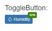
3. Add an Icon and a Badge
The next step is to display an icon and a badge within the ToggleButton. This allows you to bolster the visual rendering of the component.
    <h4>ToggleButton:</h4>

    @(Html.Kendo().ToggleButton()
        .Name("toggleButton")
        .Group("badges")
        .Selected(false)
        .Icon("droplet")
        .Badge(badge => badge
            .Position(BadgePosition.Edge)
            .Align(BadgeAlign.TopEnd)
            .Shape(BadgeShape.Rectangle)
            .Text("80%")
            .ThemeColor(BadgeColor.Success)
        )
        .Enable(true)
        .Content("Humidity")
    )
4. Handle a ToggleButton Event
The ToggleButton exposes a Toggle() event that you can handle and assign specific functions to the component. In this tutorial, you will use the Toggle() event to alert for the checked state of the component.
    <h4>ToggleButton:</h4>

    @(Html.Kendo().ToggleButton()
        .Name("toggleButton")
        .Group("badges")
        .Selected(false)
        .Icon("droplet")
        .Badge(badge => badge
            .Position(BadgePosition.Edge)
            .Align(BadgeAlign.TopEnd)
            .Shape(BadgeShape.Rectangle)
            .Text("80%")
            .ThemeColor(BadgeColor.Success)
        )
        .Events(events => events.Toggle("onToggle"))
        .Enable(true)
        .Content("Humidity")
    )

    <script>
        function onToggle(e) {
            alert("Checked state:" + e.checked);
        }
    </script>
For more examples, refer to the demo on using the events of the ToggleButton.
5. (Optional) Reference Existing ToggleButton Instances
You can reference the ToggleButton instances that you have created and build on top of their existing configuration:
-
Use the
idattribute of the component instance to establish a reference.<script> var togglebuttonReference = $("#toggleButton").data("kendoToggleButton"); // togglebuttonReference is a reference to the existing togglebutton instance of the helper. </script> -
Use the ToggleButton client-side API to control the behavior of the widget. In this example, you will use the
enablemethod to disable the component. The method is inherited from the Button widget.<script> var togglebuttonReference = $("#toggleButton").data("kendoToggleButton"); // togglebuttonReference is a reference to the existing togglebutton instance of the helper. togglebuttonReference.enable(false) </script>
For more information on referencing specific helper instances, see the Methods and Events article.