Getting Started with the ImageEditor
This tutorial explains how to set up a basic Telerik UI for ASP.NET MVC ImageEditor and highlights the major steps in the configuration of the component.
You will initialize an ImageEditor and configure some of its options.
After completing this guide, you will achieve the following result:
Prerequisites
To successfully complete the tutorial, you need a project that is already configured to use the Telerik UI for ASP.NET MVC components:
To create a new pre-configured project for the Telerik UI for ASP.NET MVC components, you can use a project template.
To manually configure an existing project by using NuGet, see the Adding Telerik UI through NuGet.
1. Initialize the ImageEditor
Use the ImageEditor HtmlHelper to add the component to a page:
- The
Name()configuration method is mandatory as its value is used for theidand thenameattributes of the ImageEditor element. - The
SaveAs()configuration allows you to set the name of the saved image file. You can also use it to configure a server proxy, which will stream the file to the end user. - The
ImageUrl()option enables you to load an initial image in the component.
@using Kendo.Mvc.UI
<h4>ImageEditor</h4>
@(Html.Kendo().ImageEditor()
.Name("imageEditor")
.Height(700)
.SaveAs(s => s.FileName("image_edited.png"))
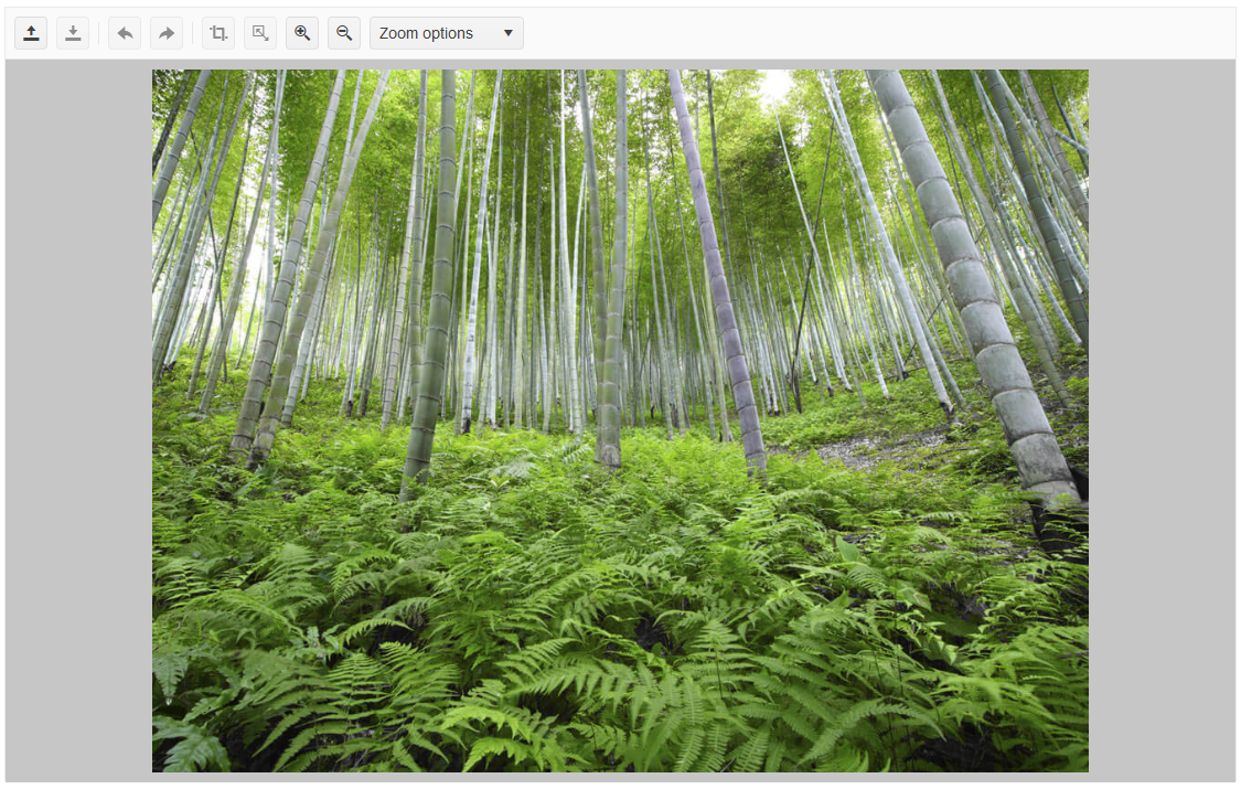
.ImageUrl(@Url.Content("~/shared/images/photos/sample.jpg"))
)
2. (Optional) Configure the Toolbar
The ImageEditor comes with a set of default tools in its toolbar, but you can use the .Toolbar() configuration to declare only the tools you want.
The following example shows how to prevent the open and crop tools from appearing in the toolbar by excluding them from the list of declared tools.
@using Kendo.Mvc.UI

<h4>ImageEditor</h4>
@(Html.Kendo().ImageEditor()
    .Name("imageEditor")
    .Height(700)
    .SaveAs(s => s.FileName("image_edited.png"))
    .ImageUrl(@Url.Content("~/shared/images/photos/sample.jpg"))
    .Toolbar(toolbar=>toolbar.Items(i=> {
        i.Add().Name("save");
        i.Add().Name("resize");
        i.Add().Name("undo");
        i.Add().Name("redo");
        i.Add().Name("zoomIn");
        i.Add().Name("zoomOut");
        i.Add().Name("zoomDropdown");
    }))
)
3. Handle the ImageEditor Events
The ImageEditor exposes various events that you can handle and further customize the functionality of the component. In this example, you will use the Error event. This event helps you detect a failed attempt to load an image in the ImageEditor.
@using Kendo.Mvc.UI

<h4>ImageEditor</h4>
@(Html.Kendo().ImageEditor()
    .Name("imageEditor")
    .Height(700)
    .SaveAs(s => s.FileName("image_edited.png"))
    .ImageUrl(@Url.Content("~/shared/images/photos/sample.jpg"))
    .Events(ev => {
        ev.Error("onError");
    })
)
<script>
    function onError(e) {
        console.log("error");
    }
</script>
4. (Optional) Reference Existing ImageEditor Instances
Referencing existing instances allows you to build on top of their configuration. To reference an existing Gantt instance, use the jQuery.data() method:
-
Use the
idattribute of the component instance to establish a reference.<script> var imageEditorReference = $("#imageEditor").data("kendoImageEditor"); // imageEditorReference is a reference to the existing instance of the helper. </script> -
Use the ImageEditor client-side API to control the behavior of the widget. In this example, you will programmatically execute the
ZoomImageEditorCommandby using theexecuteCommandmethod.<script> var imageEditorReference = $("#imageEditor").data("kendoImageEditor"); // imageEditorReference is a reference to the existing instance of the helper. imageEditorReference.executeCommand({ command: "ZoomImageEditorCommand", options: imageEditorReference.getZoomLevel() - 0.3 }); </script>
For more information on referencing specific helper instances, see the Methods and Events article.