Getting Started with the DatePicker
This tutorial explains how to set up a basic Telerik UI for ASP.NET MVC DatePicker and highlights the major steps in the configuration of the component.
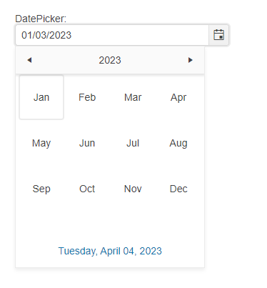
You will initialize a DatePicker component and set a default value.
Prerequisites
To successfully complete the tutorial, you need a project that is already configured to use the Telerik UI for ASP.NET MVC components:
To create a new pre-configured project for the Telerik UI for ASP.NET MVC components, you can use a project template.
To manually configure an existing project by using NuGet, see the Adding Telerik UI through NuGet.
1. Prepare the CSHTML File
The first step is to add the required directives at the top of the .cshtml document:
-
To use the Telerik UI for ASP.NET MVC HtmlHelpers:
@using Kendo.Mvc.UI
2. Initialize the DatePicker
Use the DatePicker HtmlHelper to add the component to the page:
- The
Name()configuration method is mandatory as its value is used for theidand thenameattributes of the DatePicker element. - The
Label()configuration specifies the label text of the DatePicker.
Do not set the
Name()option when usingDatePickerFor. The[ComponentName]Formethod automatically sets the control'sName()to the field it is bound to. For more information, see the Fundamentals article.
    @(Html.Kendo().DatePicker()
        .Name("datepicker")
        .Label(label=>{
            label.Content("DatePicker:");
        })
    )
3. Set a Default Value
The next step is to set a default value. The following example shows how to use the .Value() method of the DatePicker, to set the current date as a value of the component.
    @{
       var defaultDatePicker = DateTime.Now;
    }

    @(Html.Kendo().DatePicker()
        .Name("datepicker")
        .Label(label=>{
            label.Content("DatePicker:");
        })
        .Value(defaultDatePicker)
    )
4. Handle the DatePicker Events
The DatePicker component exposes convenient events for implementing custom logic. In this example, you will use the Change() event to log the value of the selected item in the browser's console.
    @{
       var defaultDatePicker = DateTime.Now;
    }

    @(Html.Kendo().DatePicker()
        .Name("datepicker")
        .Label(label=>{
            label.Content("DatePicker:");
        })
        .Value(defaultDatePicker)
        .Events(e=>e.Change("onChange"))
    )
    function onChange(e){
        var datePicker = e.sender;
        console.log(datePicker.value());
    }
5. (Optional) Reference Existing DatePicker Instances
To use the client-side API of the DatePicker and build on top of its initial configuration, you need a reference to the DatePicker instance:
-
Use the
.Name()(idattribute) of the component instance to get a reference.<script> $(document).ready(function() { var datepickerReference = $("#datepicker").data("kendoDatePicker"); // datepickerReference is a reference to the existing DatePicker instance of the helper. }) </script> -
Use the DatePicker client-side API to control the behavior of the control. In this example, you will use the
enablemethod to disable the input.<script> $(document).ready(function() { var datepicker = $("#datepicker").data("kendoDatePicker"); //Use the "value" API method to get the DatePicker's value. console.log(datepicker.value()); }) </script>