Scatter Charts
Scatter charts display data as points that are defined by the values of their items.
Scatter Charts are useful for displaying the relation between different sets of data (for example, scientific experimental results) and plotting two-dimensional data.
Setting the Primary Axes
XY Charts, such as the Scatter and Scatter Line Charts, use one or more X and Y axes which are configured through the XAxis and the YAxis properties.
    @(Html.Kendo().Chart()
        .Name("chart")
        .Series(series => {
            series.Scatter(new double[][] { new[] { 16.4, 5.4 }, new[] { 21.7, 2 }, new[] { 25.4, 3 }, new[] { 19.0, 2.0 } });
        })
        .XAxis(x => x
            .Numeric()
            .Max(35)
        )
        .YAxis(y => y
            .Numeric()
            .Min(-5)
            .Max(25)
        )
    )
Positioning the Label
The X and Y axes provide options for displaying their labels either next to the axis or at the outer edges of the plot area. By default, the labels are positioned next to the axis.
To change the label position, set the Position option of the axis labels which provides the following available options:
- (Default) When
Positionis set to"ChartAxisLabelsPosition.OnAxis", the labels are positioned next to the axis. - When
Positionis set to"ChartAxisLabelsPosition.End", the labels are placed at the end of the crossing axis. Typically, this configuration positions the labels at the top or right end of the Chart unless the crossing axis was reversed. - When
Positionis set to"ChartAxisLabelsPosition.Start", the labels are placed at the start of the crossing axis. Typically, this configuration positions the labels at the left or bottom end of the Chart unless the crossing axis was reversed.
    @(Html.Kendo().Chart()
        .Name("chart")
        .Series(series => {
            series.Scatter(new double[][] { new[] { 16.4, 5.4 }, new[] { 21.7, 2 }, new[] { 25.4, 3 }, new[] { 19.0, 2.0 } });
        })
        .XAxis(x => x
            .Labels(s=>s.Position(ChartAxisLabelsPosition.Start))
        )
    )
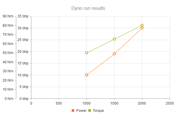
Setting Multiple Axes
You can define more X and Y axes in addition to the primary axes. The additional axes must have unique names. Series are associated to a X and Y axes by specifying their name.
Do not specify a name for the primary X and Y axes.
    @(Html.Kendo().Chart(Model)
        .Name("chart")
        .Series(series => {
            series.ScatterLine(model => model.RPM, model => model.Power)
                .Name("Power")
                .Tooltip(tooltip => tooltip.Format("{1} bhp @ {0:N0} rpm"));

            series.ScatterLine(model => model.RPM, model => model.Torque)
                .Name("Torque")
                .YAxis("torque")
                .Tooltip(tooltip => tooltip.Format("{1} lb-ft @ {0:N0} rpm"));
        })
        .XAxis(x => x
            .Numeric()
            .Title(title => title.Text("Engine rpm"))

            // Align torque axis to the right by specifying
            // a crossing value greater than or equal to the axis maximum.
            .AxisCrossingValue(0, 10000)
            .Labels(labels => labels.Format("{0:N0}"))
        )
        .YAxis(y => y
            .Numeric()
            .Title(title => title.Text("Power (bhp)"))
        )
        .YAxis(y => y
            .Numeric("torque")
            .Title(title => title.Text("Torque (lb-ft)"))
        )
    )
Because no axis is specified, the first series is associated with the default Y axis. The torque series are plotted on the torque Y axis.
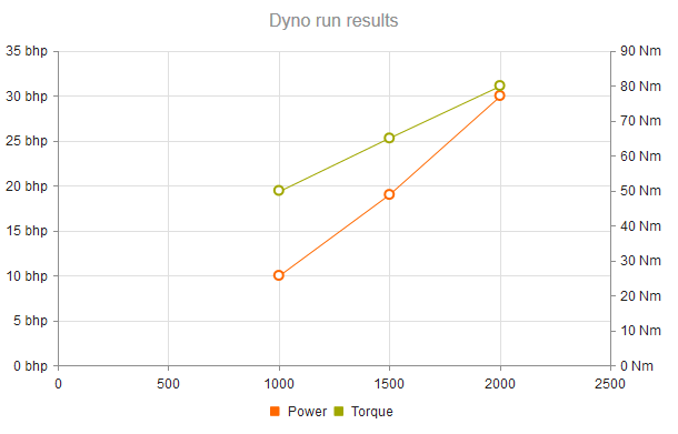
Arranging the Axes
You can also control the arrangement of the X and Y axes by specifying the values at which they cross the primary axes.
    .XAxis(x => x
        .Numeric()
        .AxisCrossingValue(0, 2500)
    )
The primary Y axis crosses the X axis at point 0 (leftmost). The second, torque Y axis crosses the X axis at the 2500 mark or at its right end, whichever comes first.
Smooth Scatter Line
By default, the series in the Scatter Line Chart are connected with a straight line.
To display a smooth line, use the Style(ChartScatterLineStyle.Smooth) setting of the Series configuration.
    @(Html.Kendo().Chart()
        .Name("chart")
        .SeriesDefaults(seriesDefaults =>
            seriesDefaults.ScatterLine().Style(ChartScatterLineStyle.Smooth)
        )
        .Series(series => {
            series.ScatterLine(new int[][] {
                    new [] {10, 40}, new [] {17, 50}, new [] {22, 70},
                    new [] {35, 60}, new [] {47, 95}, new [] {60, 100}
                })
                .Name("1.6C");
        })
    )
Pan and Zoom
The Pan and Zoom features enable easy navigation and zoom control within the Scatter Chart to observe the data in different segments and portions according to your preferences.
To enable panning, use the Pannable setting. To turn on the zooming functionality, configure the Zoomable option.
    @(Html.Kendo().Chart()
        .Name("chart")
        .Series(series => {
            series.ScatterLine(new int[][] {
                    new [] {10, 40}, new [] {17, 50}, new [] {22, 70},
                    new [] {35, 60}, new [] {47, 95}, new [] {60, 100}
                })
                .Name("1.6C");
        })
        .Pannable()
        .Zoomable()
    )