Donut Charts
The Telerik UI Donut Chart HtmlHelper for ASP.NET MVC is a server-side wrapper for the Kendo UI Donut Chart widget.
The Donut Charts are a Pie chart variation with the ability to display data as single-series sectors from a two-dimensional circle.
Getting Started
Donut Charts are suitable for showing the proportions of categorical data, with the size of each piece representing the proportion of each category. In comparison to its Pie Chart predecessor, it helps avoid confusion around the area parameter that often trips people up in a Pie Chart.
To create Donut series in the Chart component, use the Donut configuration method within the Series configuration.
- Creating the Donut Chart
- Configuring the labels visibility
- Configuring the labels alignment
- Configuring the effects overlay
Also, you can configure the Donut Chart for Inline, Local, and Remote data binding.
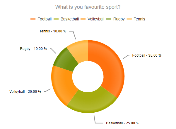
Creating the Donut Chart
The following example demonstrates how to define a Donut Chart with a single series.
    @(Html.Kendo().Chart()
        .Name("chart")
        .Title("What is you favourite sport?")
        .Legend(legend => legend
            .Position(ChartLegendPosition.Top)
        )
        .Series(series => {
            series.Donut(new dynamic[] {
                new {category = "Football",value = 35},
                new {category = "Basketball",value = 25},
                new {category = "Volleyball",value = 20},
                new {category = "Rugby",value = 10},
                new {category = "Tennis",value = 10}
            })
            .Labels(labels => labels
                .Visible(true)
                .Position(ChartPieLabelsPosition.OutsideEnd)
                .Template("#= category # - #= kendo.format('{0:P}', percentage)#")
                .Background("transparent")
            );
        })
        .Tooltip(tooltip => tooltip
            .Visible(true)
            .Template("#= category # - #= kendo.format('{0:P}', percentage) #")
        )
    )
Configuring the Labels Visibility
You can show or hide the Donut Chart labels through the Visible() configuration method for the given series.
    .Series(series =>
    {
        series.Donut(new dynamic[] {})
            .Labels(labels => labels
                .Visible(true)
        );
    })
Configuring the Labels Alignment
The Donut Chart allows you to configure the label alignment for the series through the Align() method.
    .Series(series =>
    {
        series.Donut(new dynamic[] {})
            .Labels(labels => labels
                .Align(ChartSeriesLabelsAlign.Circle)
            );
    })
The Donut Chart supports two modes of label alignment:
-
Circle(default)—The labels are positioned in a circle around the Chart. -
Column—The labels are positioned in columns to the left and right of the Chart.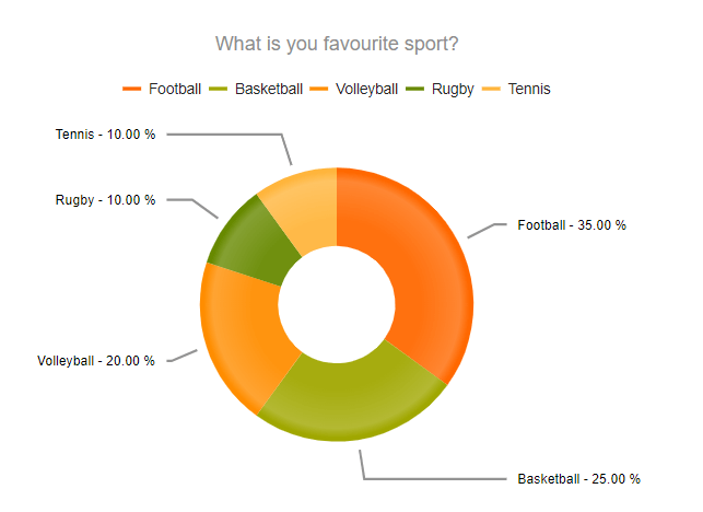
Configuring the Effects Overlay
Each segment has a transparent effect overlay that adds depth to the two-dimensional shape. The overlay transparent gradient is configurable through the Overlay() option.
    .Series(series =>
    {
       series.Donut(new dynamic[] {})
       .Overlay(o => o.Gradient(ChartSeriesGradient.None));
    })
The Donut Chart supports the following ChartSeriesGradient options:
-
(Default)
RoundedBevel
-
SharpBevel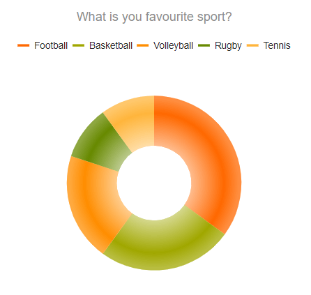
-
None