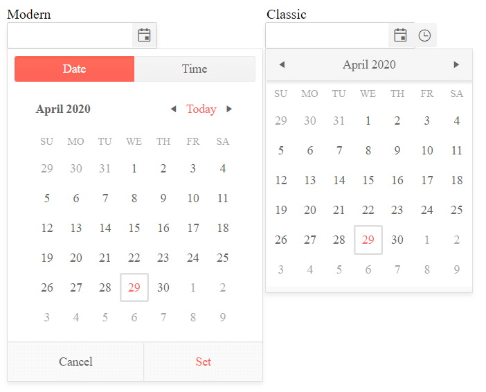
Component Types
As of R2 2020 version of the Telerik UI for ASP.NET Core suite, the DateTimePicker widget introduces a new component type. It aims to enhance the existing rendering and deliver a fresh and modern look and feel.
By default, the DateTimePicker is initialized with the classic render mode. In order to set it to modern, configure the options of the widget as follows:
    @(Html.Kendo().DateTimePicker()
            .Name("dateTimePicker")
            .ComponentType("modern")
    )
<kendo-datetimepicker name="datetimepicker" component-type="modern"/>
As a result, the appearance of the widget is alternated.
The rendered selectors in the time picker of the Telerik UI DateTimePicker for ASP.NET Core depend on the currently applied format. If the format is omitted, the default format from the application's culture is used.